Hey there,
I am currently working on a FAQ section, and I wanted to display multiple columns without adding two accordion elements. I tried flex and grid, but they always matched the opened items height or left gaps.
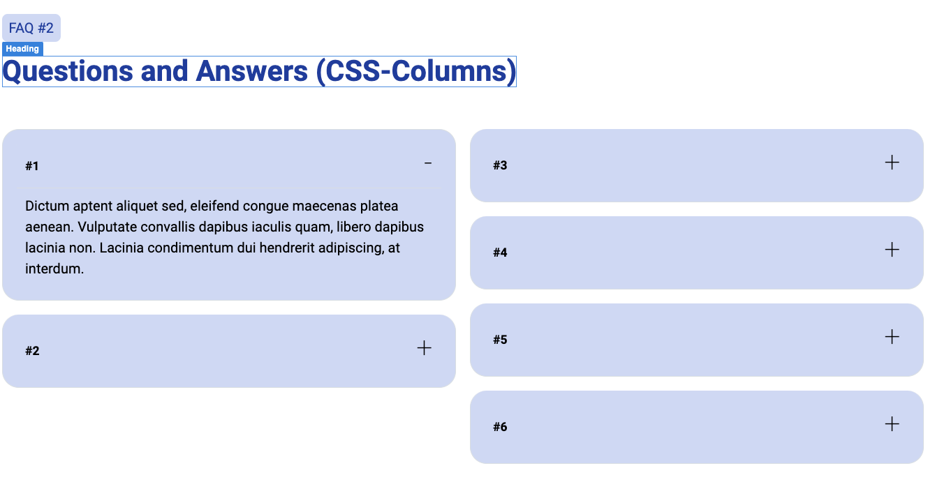
Then I tried CSS columns, but the padding wraps into the other columns -see screenshot.
I’m not entirely clear on what it is you’re trying to do here, but I would recommend you post this question in the Webdesign Help category, as this does not pertain to using features of the Bootstrap Studio software. This seems like something custom you’re trying to create.
True, thank you. I changed the category.
I’m trying to create a FAQ section with two “columns” even though the content is supposed to live in just on container.
I created two examples which are almost working (flex and columns). After seeing your testimonials in the other thread, I might need to use masonry for it.
Interesting idea. I will have to meditate on this a bit. I’m not entirely clear on the flow here. Are the Accordion items starting from left-top and going to right bottom?
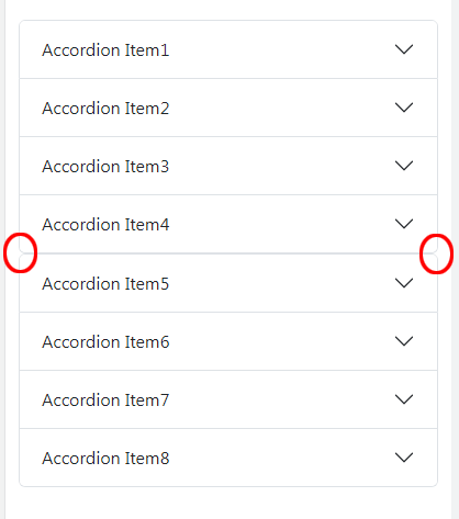
Perhaps you could add numbers to each item in your sample (ie. Accordion Item 1, Accordion Item 2, Accordion Item 3…) That would make it easier for me to understand how you’re trying to “flow” the questions.
The CSS columns method would seem to the be the right way to do this. The order of the elements makes more sense (1,2,3 in the left and 4,5, 6 in the right. The behavior is what I would expect except that the overflow from question 3 is going into the next column.
I’m not really familiar with the variable below, but when I changed the clamp function from this…
--spacing-basis: clamp(1rem, 1.8vw, 2rem);
to this…
--spacing-basis: clamp(4rem, 1.8vw, 2rem);
If fixed the issue of the third accordion item flowing into the second column.
But there’s still some visible jumpiness, so I wouldn’t consider this a perfect solution. Hoever, maybe it can get you pointed in the right direction of what needs to be done?
The variable is the basis for my responsive sizing, e.g., content gap, container gap, paddings etc. So, I cannot change it like suggested. I’ll try static values that may prevent the overflow. Otherwise, I’ll stick to the more traditional approach with two different accordions.
I sometimes encounter these sorts of challenges and wrack my brain for hours trying to figure out a clever solution to make things work the way I want, but often I realize it’s just “costs vs benefits” and resort to using the less “clever” solution (which often involves duplicate components that are shown/hidden at different screen sizes.)
This is is nit-picking, but it needs a some CSS & media queries so as to not look like two accordions stacked on one another when the columns go from two to one.
