This is my portfolio website which I designed in Bootstrap Studio.
Any suggestions or criticism is most welcomed. Do let me know your thoughts.
This is my portfolio website which I designed in Bootstrap Studio.
Any suggestions or criticism is most welcomed. Do let me know your thoughts.
the blob at the background changes size and position everytime i refresh the page, pretty cool. what do you call this effect ?
A few observations…
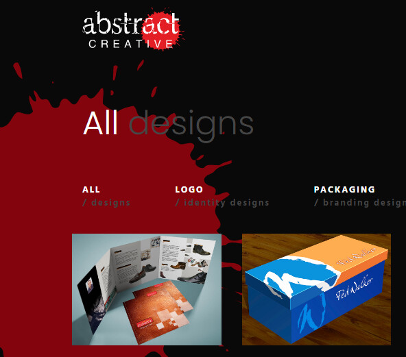
Not sure what you’re using to generate the red ink splash graphic, but I had to reload the site three times before it showed up in the viewport. You might want to see if there’s some way you can constrain its coordinates to ensure it appears within the viewport.
You may want to consider omitting the red ink splash graphic on your work page, as the color gray you’re using for the text is hard to read with the red behind it (see image below.) Or you could use lighter gray.
overflow: auto rule.You’re not utilizing any heading tags. This can hurt your SEO.
Lighthouse reports an error in your robot.txt file.
To an English speaker, this sentence…
“We are qualified and professional graphic and web designers having experience of over 27 years.”
…is grammatically awkward. Consider changing it to…
“We are qualified and professional graphic and web designers with over 27 years of experience.”
Unrelated to the website - Your graphic design skills are OUTSTANDING! ![]()
![]()
![]()
Thank you @printninja for your feedback, I definitely will follow your suggestions. Thank you once again.
Nice creations! If I had to say something about a missing point – you asked ![]() --, I would say that there’re no pictures of you or your team and, in my opinion (so, not necessary universal), this puts distance. In a world that is more and more digital, more and more automatic, more and more in a no face mindset, seeing that there’re real people behind is always a plus. This said, I searched to absolutely find a negative point
--, I would say that there’re no pictures of you or your team and, in my opinion (so, not necessary universal), this puts distance. In a world that is more and more digital, more and more automatic, more and more in a no face mindset, seeing that there’re real people behind is always a plus. This said, I searched to absolutely find a negative point ![]()
Thanks for the suggestion @elroot, You pointed out a “The most needed human” point that is really missing. I will surly do it.
Looks good.
I did notice that the We make awesome Designs does not show correctly when changing to the different words in the Samsung Galaxy 10.1 tablet in the vertical position (686 x 900 px) or when using the Moto G Play smartphone in the horizontal view (not sure of the size).
Well! I will have to look into it. Thanks @bbfi.