Trying to follow the tutorials. But trying to use the alignment with the default Navbar (selected NAV-item) has no effect what so ever.
I’ve tried aligning every possible item to the right, but it has no effect at all. One acctually has to delete almost all elements, (Brand can stay). Only then does alignment seem to work.
I’ve seen other posts potentially mentioning the same.
However, this effectively renders all of your tutorials almost completely broken from the start. Since a beginner would find it extremely frustrating not being able to acctually follow along.
Seems to work in the 3 tutorials I just looked at. Are you selecting the Nav in the Overview tree, then selecting the options menu and setting the alignment to left, center, or right ?
Yupp. I’ve honestly done as much research as possible before posting. Since a few prior replies seemed to be more of the RTFM-nature, other than being helpful. So I really wanted to avoid that
I’ve tried the Tesla Tutorial, and the “Real Website” tutorial. And it doesn’t work to switch the alignment using the standard ‘Navbar’. I’m not talking about the “extra fancy ones i.e. clean etc”. But doing as it’s done exactly in the tutorial. And I’ve been banging my head against the proverbial wall for a few hours already
In the Tesla Video the Nav is duplicated for the far right group of nav-items. Then the demonstrator selects the top Nav (center group) and goes to the Options, chooses Alignment setting Center. That should be all you need to do.
(If you also choose the right Nav and set Alignment setting to Right it will throw the center group off.)
I’m assuming that by “alignment” you mean that the elements that follow the navbar are rendered incorrectly in the vertical direction, since you gave no example.
In a course at Udemy, navbar did not work properly in a manual example of Bootstrap coding that used ScrollSpy. I think the reason is that navbar is attached to the top of the page using the “fixed-top” class. This removes it from the normal stream of HTML elements on the page, just like “position: absolute” removes an element. So all the following elements start at the top of the page instead of following the navbar.
The fix the teacher came up with is in JavaScript: it moves a ScrollSpy element that follows the navbar so it is rendered below the navbar.
Here is the code. Hope it is useful. The corrections for navbar height are the two expressions “$(’#main-nav’).outerHeight()”.
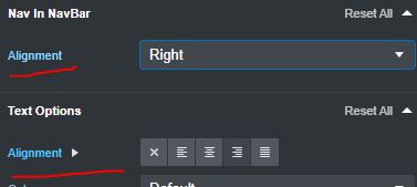
However, I’ve since noticed that this was entirely user error. Despite my truthfully best efforts. I was focused on the “Text Options > Alignment”, not the alignment just above it I don’t know why I was blind to see the difference between the two. Although, the UI-differences between the release and tutorial-version of BSS doesn’t really help in this regard.
Thanks for your patience! Indeed a RTFM turned out to be the right answer.
Unfortunately, the videos are quite old, the text info is more up to date, but still lacking in many areas. Hopefully they will get around to getting new videos up soon, but glad you got it worked out!

 I don’t know why I was blind to see the difference between the two. Although, the UI-differences between the release and tutorial-version of BSS doesn’t really help in this regard.