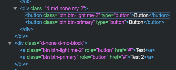
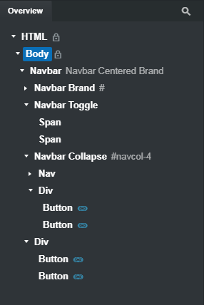
This is because this Navbar uses four buttons in total, two of them in one Div, and two in another, and it displays the divs depending on the screen size. For explanatory purposes, I’ve taken screenshots, brought them into Photoshop and moved the relevant panels into the middle so you can see the areas I’ve highlighted.
When the screen width is medium or above and I select the second Div in the Overview panel that contains two buttons, the Options > Responsive Display settings show Display None at the XS (first) setting and Block at the MD setting. This results in the buttons being hidden on XS and SM screen widths, but visible at MD and above.
If I change the screen width to SM and open the Drop down menu, now we can see another pair of buttons that LOOK the same as the first two buttons, but these are in fact a completely different pair of buttons. If I highlight the first Div in the Overview panel, you can see those buttons are selected, and looking at the Options panel > Responsive Display > Display, the XS setting is Default, and the MD setting is None. The result is that these buttons are visible at XS and SM sizes, but not visible at MD or above.
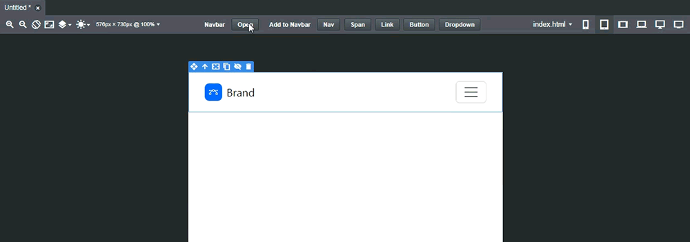
If I reset the Responsive Display options to their defaults, the result is you end up seeing all four buttons in the Navigation menu at all screen widths, which is undesirable.
The reason this Navbar has been designed like this, with “redundant” buttons is because the Navbar brand is centered at MD and above sizes, so it creates a layout problem with the buttons being before the brand on mobile, and after the brand on desktop.
So essentially, whatever you do to the buttons at the MD and above sizes, you need to do to the other buttons at the SM and below sizes. This is a cludgy solution though considering we have a more elegant way to handle this.
If you want the buttons to read and behave identically regardless of screen size, the simplest solution would be to just delete one set, copy the other set, and paste them where the deleted buttons were, but past them as LINKED elements. This way, if you change the text or function of one button at any screen size, its companion button will also change.
This is probably how the component should have been made from the start.