NavBar: howto align with several items to the right?

Hi, i use the blank template and add only a Navbar. I align the NavBar to the right. It looks ok with 3 items:

Now i add more items and i get a 2nd line:

The items in the DIV are now left aligned.

How can i align in the 2nd pic the items to the right ?

Thanks for your help. Regards

Matthias

They are not left aligned. That is normal behavior when a <li> element exceeds the width of the parent container.

Select the Nav Item and use flexbox to set it to a flex container and make the Direction Row Reverse.

Study Bootstrap flexbox. Without a good grasp of how flexbox works, you will continue to struggle with layouts in this software.

I have to select “Nav”, not “Nav Item” and change in the flex the direction. Unfortunately the sequence of the items is turned (as the name says):

This not the result i expect for only “align to the right”.

The result with small screens looks strange too (only changed to reverse order):

9

Why the items are not on the left and vertically ? Same example with direction default:

10

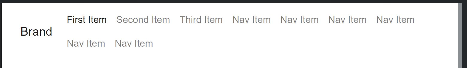
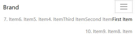
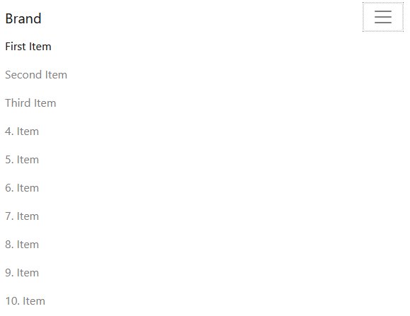
Use text alignment to center or right-align items in the hamburger drop-down menu. Flex settings are breakpoint specific. Expand the the triangle to see the different breakpoints and adjust accordingly. What you are doing is very bizarre and not typical UI. When a menu has too many items to display on one line, then change the breakpoint at which it switches to mobile. Reduce the padding between the links. Use a narrower font or reduce the font size.

Experiment! Try stuff out! You have to learn the program. Can’t keep coming here every time you run into a basic feature you don’t understand. Watch the videos. Read the tutorials. Build a site alongside one of the videos. Read the Bootstrap tutorials on W3Schools or the Bootstrap website. This forum category is for help with using the software, not teach people step-by-step how to customize different components.