Hi, I am struggling here and need some help please. I have a link in my navbar with an image in it. This is the company logo. It looks great on all scree sizes except XS where it looks too big and is too close to the top and bottom navbar edges. How can I set this image (or link box) to reduce to 75% size on XS screens only? I have tried so many things I cannot remember! Can anyone impart some knowledge please?
Cheers,
Tom
You could try something like:
@media (max-width: 576px) {
  .yourlogoclass {
    max-width: 75vw;
    margin: .5rem 0;
  }
}
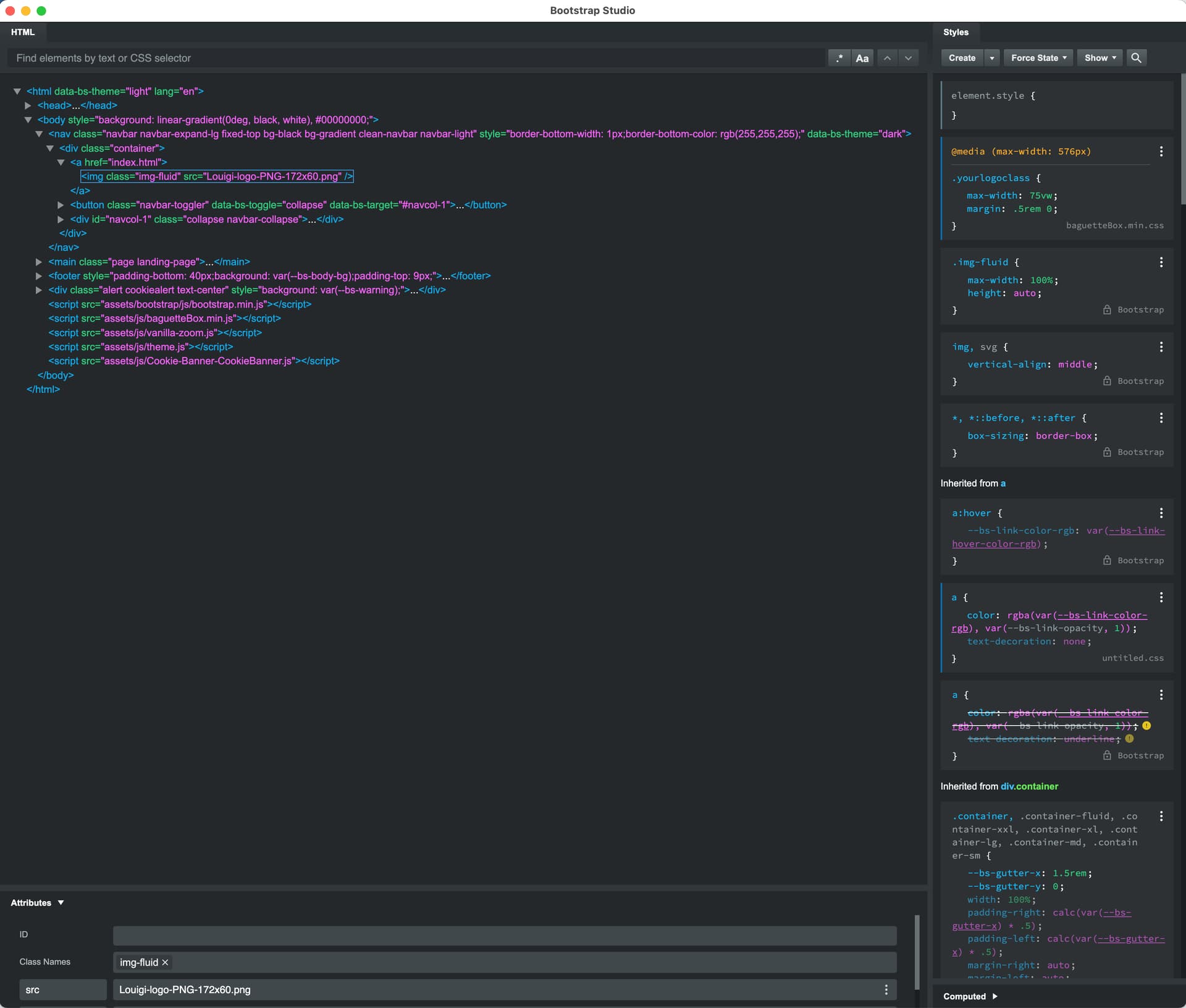
Thank you. Unfortunately this isn’t doing anything. I selected the Image (not the Link), clicked Create in Styles (this made a baguetteBox.min.css), pasted in your text, made sure the image was responsive, but it is not working. Am I missing something?
Thanks for the help.
You will need to change the class name to suit and add the class name to your image
Thanks… and I’m really sorry, but can you show / tell me how to do that? And should I remove the ‘img-fluid’?
I am trying my best to learn BSS and only dip into this CSS stuff when necessary, but I do need a helping hand with it!
With your logo that size (172x60) you don’t need any css. Just drop the image into the standard navbar in the Navbar Brand and set the height and width :
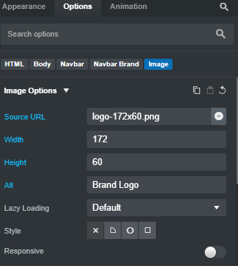
An example of this here:
https://scrolltotop.bss.design/
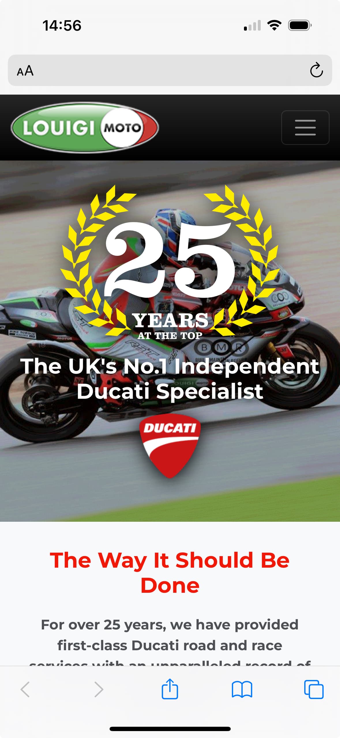
Thanks, but unfortunately nothing has changed and this still doesn’t do what I want it to do. To my eyes, the logo at 172x60 is good on all screen sizes except XS where it is too large (iPhone screenshot attached). I would like it to be 129x45 on XS screens. Is this possible?
Thanks, Tom.
Try this css:
.navbar-brand img {
  max-width: 129px;
  height: auto;
  margin-block: .5rem;
}

@media (width > 576px) {
  .navbar-brand img {
    max-width: 172px;
    height: auto;
    margin-block: 1rem;
  }
}
The first block sets the width of the image for mobile first (xs)
Setting the max-width to 129px; (you could also just use width: rather than max-width:)
The second block sets the max width of the image to 172px on devices over 576px wide
I’ve added some margins for the top and bottom, change the values to suit your needs.
The example in the previous post has been updated to show how it would look
1 Like
Hi Richard, thank you so much for this, it is working perfectly and my eyes are now happy with the logo size!
1 Like