Hi all, and sorry for my English cause I’m french.
I’m newby with bootstrap and need some help with Navbar.
My site can be seen here [http:\Thony50.free.fr]
1/ The logo for Dropdown Menu when the screen is small is not displayed on my Iphone, but the preview on PC is ok. But it can be clicked at the place where it should be displayed. I don’t understand why.
2/ I don’t find how to have a blue background on menu item when focus is hover.
3/ I don’t find how to place the menu when displayed on a iPhone to the right.
4/ I don’t find how to scroll down all the page in order to display the menu on iPhone in a blank area. It only work with my first item
5/ and the last, when I click to an item linked to a DIV, the div is displayed but hidden by the menu because it take the place at the top and not after the menu.
You have a minus margin on the navbar-toggler-icon, if you want to shift it up, try putting the margin on the button.
Something like this:
.nav-item:hover {
  background: blue;
}
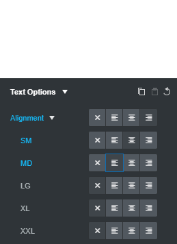
Select your nav element and change the text alignment:
In the above example mobiles will be aligned right,
(SM)small screens center
and (MD) Medium and above to the left
Not sure if I understand this
Give your navbar an id of mainNav and add the following javascript (taken from agency template)
(function() {
  "use strict"; // Start of use strict

  var mainNav = document.querySelector('#mainNav');

  if (mainNav) {

    var navbarCollapse = mainNav.querySelector('.navbar-collapse');

    if (navbarCollapse) {

      var collapse = new bootstrap.Collapse(navbarCollapse, {
        toggle: false
      });

      var navbarItems = navbarCollapse.querySelectorAll('a');

      // Closes responsive menu when a scroll trigger link is clicked
      for (var item of navbarItems) {
        item.addEventListener('click', function (event) {
          collapse.hide();
        });
      }
    }
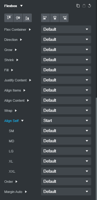
You have an inline style of margin-top: -69px; on the Navbar Toggle icon span.
This is incorrect. Remove this and then do the following…
Go to the Overview Panel (lower left), expand the Navbar component and select the Navbar Toggle component
Go to the Options Panel (upper right), scroll down to the Flexbox options, click Align Self to expand the settings and change the first setting from Default to Start as shown below.
If the toggle is higher than you like, you can use a Bootstrap utility class like mt-1 or mt-2 to make it a little lower. Go to the Attributes panel and with the Navbar Toggle still selected, type mt-1 (or mt-2) into the Class Names field and hit enter.
(Also, I don’t know if you did it deliberately, but your links turn white when they are active, which makes them effectively invisible. Not sure why you’d want this, but I think it’s confusing and would recommend changing it.)
1/ The icon is now OK on my iPhone by removing the “inline style of margin-top: -69px ; on the Navbar Toggle icon.” and used the printninja way with having “start” to Align Flex for SM and MD screens. It is perfect. Thanks.
2/ Is OK with background. ! I don’t understand because I’m sure I tryed it before…
3/ The Menu on my iPhone is now on the left using a margin-left to my NavBarCollapse. So OK
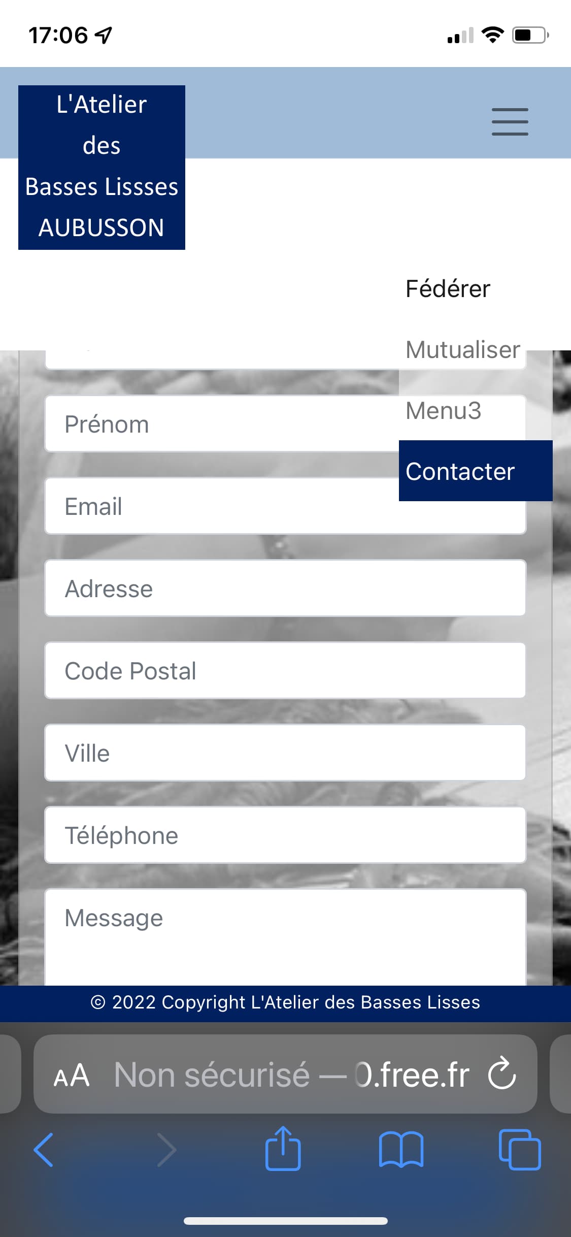
For the others problems I will try to explain with some photos
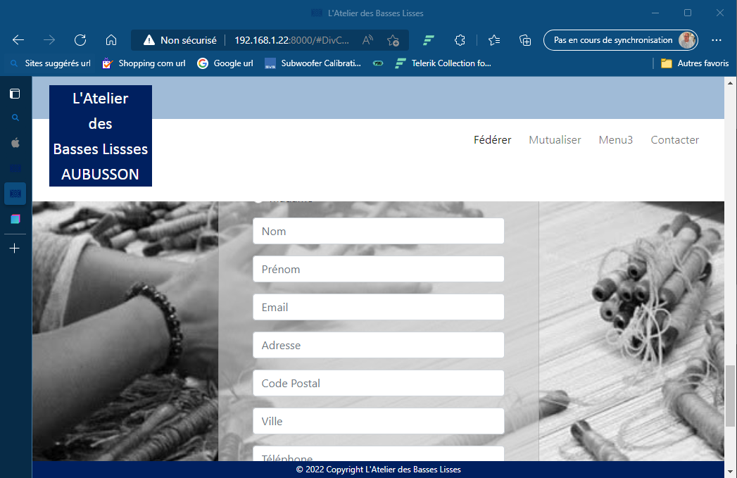
The first image show what I have when the menu item “Contacter” is clicked.
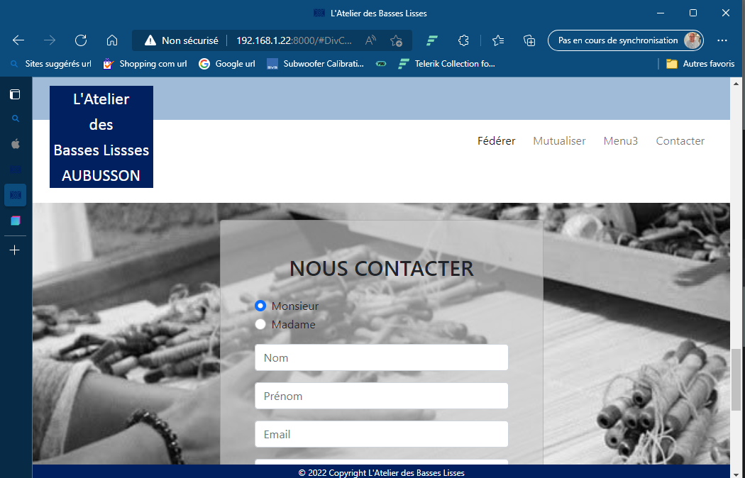
And the second image show what I would like to see.
Same for others items, the ‘jump’ is no good and the top of the Div are missing (except for the first one : Fédérer)
On an iPhone, this is the same things and more… The script for autoclosing the menu after I chose a item don’t work for me. The menu stay visible. And this menu is a little bit too much on bottom
(function () {
  "use strict"; // Start of use strict

  var mainNav = document.querySelector("#mainNav");

  if (mainNav) {
    var navbarCollapse = mainNav.querySelector(".navbar-collapse");

    if (navbarCollapse) {
      var collapse = new bootstrap.Collapse(navbarCollapse, {
        toggle: false,
      });

      var navbarItems = navbarCollapse.querySelectorAll("a");

      // Closes responsive menu when a scroll trigger link is clicked
      for (var item of navbarItems) {
        item.addEventListener("click", function (event) {
          collapse.hide();
        });
      }
    }
  }
})(); // End of use strict
It works, In your navbar the navbar-brand links to #,
add an id to the body tag “page-top” and let the navbar-brand link to #page-top.
The Fédérer links to #CadreTexte1 and that id does not exist on the page.
The menu3 links to # change that to an anchor on the page
I started off playing with the navbar, just to have a linear-gradient background replacing the image. That was during a meeting. Then I started playing with your js file and couldn’t stop half way
