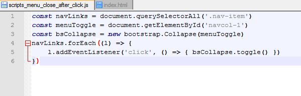
I was a little quick when I answer you, if you add a dropdown to your navbar the code above will make you disappointment. It will collapse the menu when an user click the dropdown.
clickable dropdown
(function() {
	"use strict";
	const myNav = document.querySelector('#myNav');
	if (myNav) {
		const navbarCollapse = myNav.querySelector('.navbar-collapse');
		const navbarItems = navbarCollapse.querySelectorAll('a');
		if (navbarCollapse) {
			const collapse = new bootstrap.Collapse(navbarCollapse, {toggle: false});
			navbarItems.forEach(item => item.addEventListener('click', e => {
				if (!e.target.matches('a[data-bs-toggle]')) collapse.hide();
			}));
		}
	}
})();
if you want the dropdown to open the menu when hover
hover dropdown with CSS
only on desktop or bigger
@media all and (min-width: 992px) {
  .navbar .nav-item .dropdown-menu {
    display: none;
  }
}

@media all and (min-width: 992px) {
  .navbar .nav-item:hover .nav-link {
  }
}

@media all and (min-width: 992px) {
  .navbar .nav-item:hover .dropdown-menu {
    display: block;
  }
}

@media all and (min-width: 992px) {
  .navbar .nav-item .dropdown-menu {
    margin-top: 0;
  }
}
or if you want to do it with Javascript
hover dropdown with javascript
only on desktop or bigger
function() {
	"use strict";
	const myNav = document.querySelector('#myNav');
	if (myNav) {
		const navbarCollapse = myNav.querySelector('.navbar-collapse');
		const navbarItems = navbarCollapse.querySelectorAll('a');
		if (navbarCollapse) {
			const collapse = new bootstrap.Collapse(navbarCollapse, {
				toggle: false
			});
			navbarItems.forEach(item => item.addEventListener('click', e => {
				if (!e.target.matches('a[data-bs-toggle]')) collapse.hide();
			}));
		}
		document.addEventListener("DOMContentLoaded", function(){
			if (window.innerWidth > 992) {
				document.querySelectorAll('.navbar .nav-item').forEach(function(navitem){
					navitem.addEventListener('mouseover', function(){
						let el_link = this.querySelector('a[data-bs-toggle]');
						if(el_link != null){
							let nextEl = el_link.nextElementSibling;
							el_link.classList.add('show');
							nextEl.classList.add('show');
						}
					});
					navitem.addEventListener('mouseleave', function(){
						let el_link = this.querySelector('a[data-bs-toggle]');
						if(el_link != null){
							let nextEl = el_link.nextElementSibling;
							el_link.classList.remove('show');
							nextEl.classList.remove('show');
						}
					});
				});
			}
		});
	}
})();