Hello. How can I give different margins or paddings depending on the size of the screen? I imagine adding css, but can I do it through the side menu? A greeting
You would use media queries for things you want different for different screen sizes.
you can use the p class
p-2
p-sm-2
p-md-2
p-lg-2
p-xl-2
where 2 in the example above can be from 0 to 5
you can also use px and py
so if you want big padding on a mobile and less on a desktop you could use something like:
class=“p-5 p-sm-3 p-lg-1”
you can also do the same with margin m-2 etc
More info here:
Thank you very much for your responses. I’m going to try them.
1 Like
@richards can we get a dropdown menu for this pleassseee
FYI - @richards is not a developer, he’s a user like you and me.
If you have a feature request, you should post it in the Ideas Category of the forum, and tag the main developer of the software, who’s name is Martin. Just put an @ sign before you start typing the name, and you will see his profile pop up so you can tag him in your post
Also, there is already a dropdown option for margin and padding utility classes. You need to read the Documentation and become familiar with the program’s UI so you’ll know what features it already has.
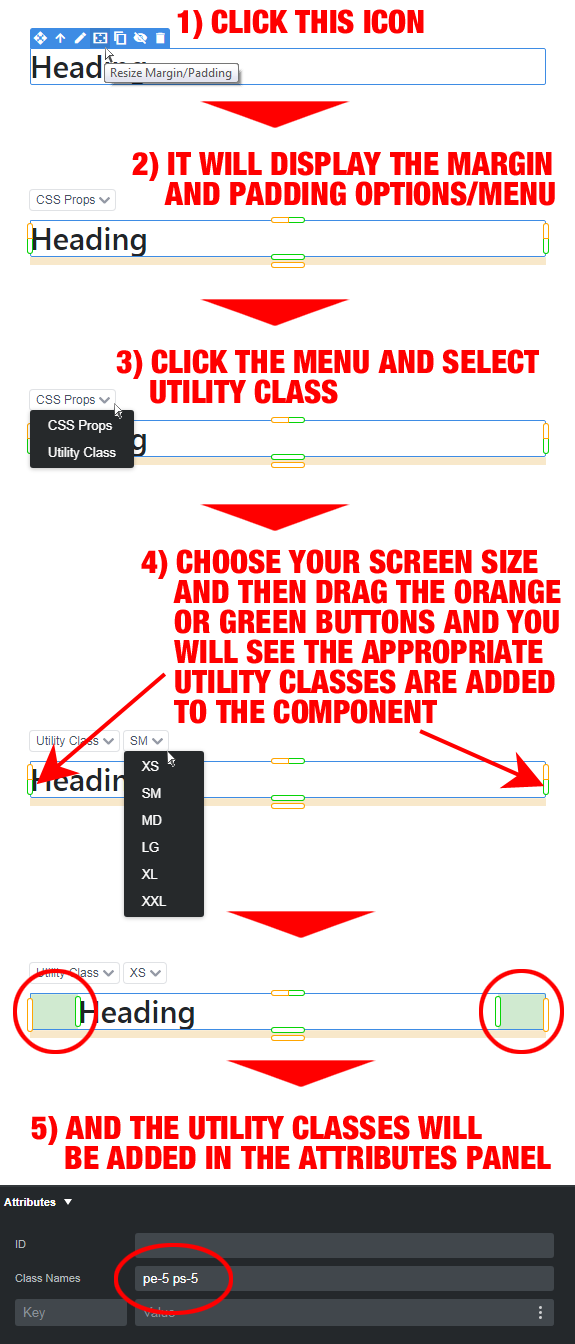
See the below image to access the dropdown menu for margin and padding on components. Personally, I think it’s a lot easier to just learn the Bootstrap utility classes and type them directly into the Attributes panel.
4 Likes
thank you so much and i will keep that in mind