I tried to follow along on the YouTube video to create a portfolio website in BS, but I can’t for the life of me figure out out to make the parallax background image responsive!
Any help would be greatly appreciated!
I tried to follow along on the YouTube video to create a portfolio website in BS, but I can’t for the life of me figure out out to make the parallax background image responsive!
Any help would be greatly appreciated!
The image in the parallax component is not really meant to be responsive because the parallax effect relies on a fixed height. If you want to force it to be responsive with the screen width, you can try making the height a variable value.
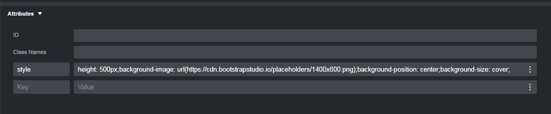
In Bootstrap 5, the parallax component uses JavaScript for the functionality, and inline CSS for the styling. You can see the inline CSS rules in the Attributes panel…
In the Style panel, try changing the rules to the following…
element.style {
  height: 35vw;
  max-height: 600px;
  background-image: url(https://cdn.bootstrapstudio.io/placeholders/1400x800.png);
  background-position: center;
  }
Depending on the image you’ve used, you may have to play around with the viewport width value to get it to look the way you want.
Unfortunately I can’t get either of the parallax components to work. The page loads, then the parallax image disappears.
It’s going to be impossible to diagnose your problem without seeing the website/code. Can you post a link to the live site?