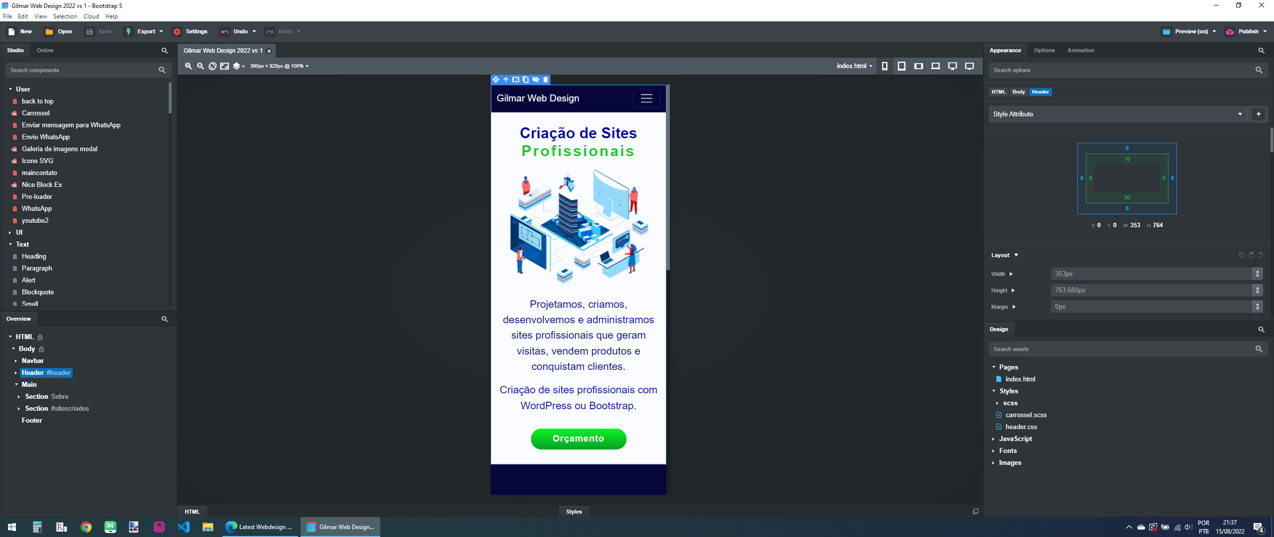
I don’t know if it’s really an error, but I’m not able to generate a preview in BSS for mobile devices that corresponds to the display of the site after it’s published, in the program we have a surplus in the visualization, this makes it difficult to create the site, if it is possible to limit the display, or there is a setting to do this, would be very nice.
In fact, it looks like the site only respects dimensions in the PWA.
When setting an autura of 100vh, in mobile browsers there are always problems, but the PWA works perfectly fine.
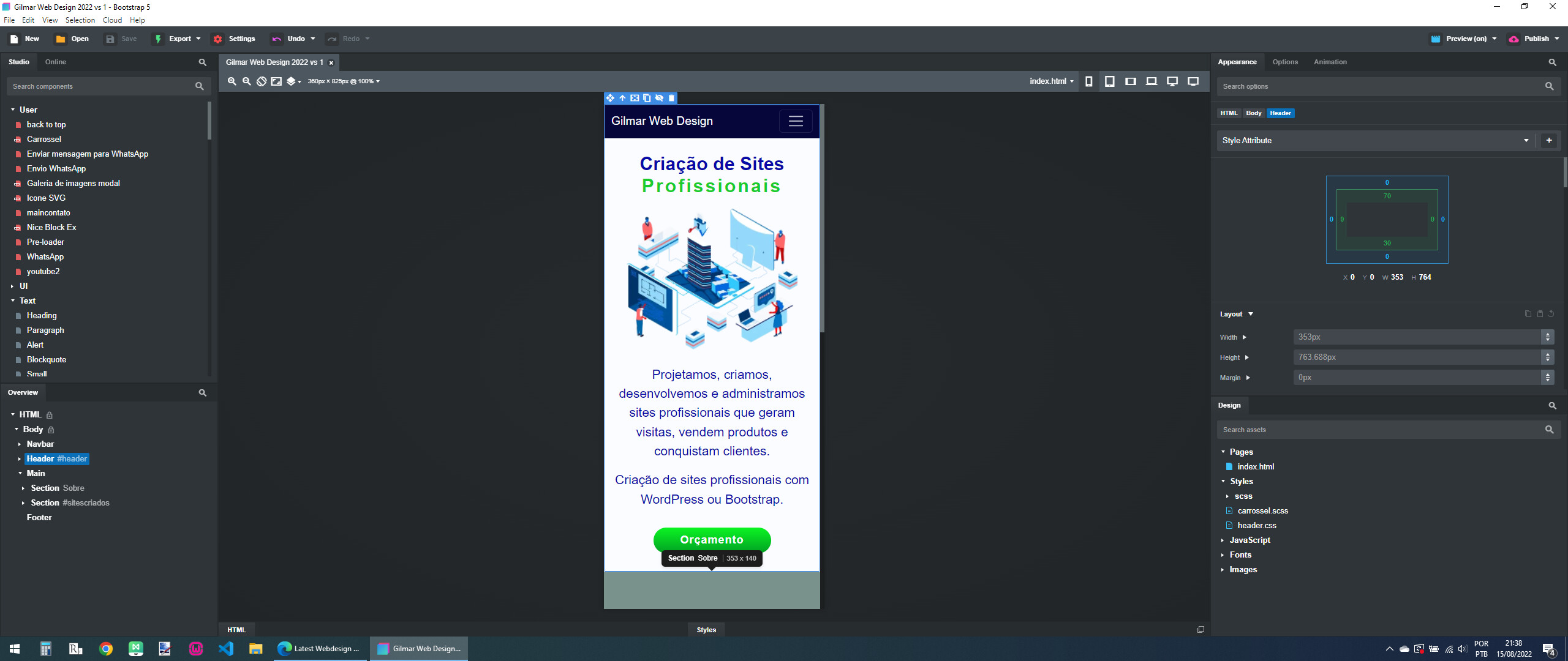
This is the site I’m making and having these difficulties.
A screenshot of the BSS screen, note a blue bar at the end of the site, this is the excess I referred to.
This really causes difficulties to know the result of the published site, having to do several tests to reach a favorable result.
It’s a very big waste of time.
If the height set to 100vh would bring the correct end results, with no pops, it would be very good to work with.
Remembering that the program has 6 types of display on devices, doing this for each one would really consume a lot of time.
I’m not entirely clear on what your issue is, but if you go to the top menu, choose File > Settings > Devices, you can create a custom device to simulate the pixel width and height of any screen you want.
In general, I’ve found it’s best to preview the site you’re working on on an actual mobile device (as opposed to using a desktop browser simulating a mobile device.)
Not sure if this helps, but if you have a WiFi network, you can preview your BSS site on your mobile device in real-time, just like in a desktop browser on your computer. Just open a browser on your phone and enter the network IP address that BSS generates in the browser’s URL bar.
You’ll get the same real-time preview of your website on your phone/tablet that you’d get on your desktop. Of course, you must have a WiFi network on your system to do this.
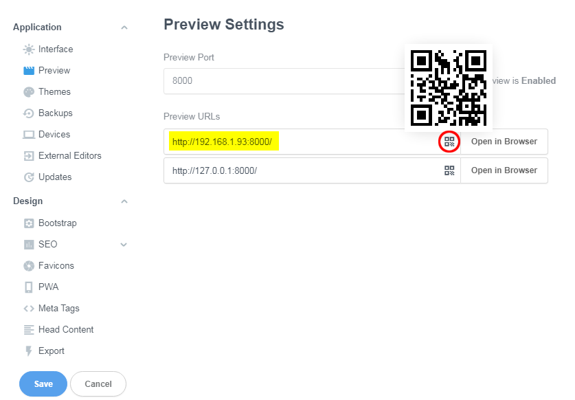
Just noticed the scan code is available to preview on mobile in Bootstrap Studio settings to open in browser. Hold your phone up and open your camera and it will ask to take you to the site. Wow !
The mobile browser sees 100vh as the height of the phones screen including the URL bar, on a PWA (if you have fullscreen) there will be no URL bar so it works ok.
@twinstream Been using this program for four years, and it never dawned on me that there were QR codes to go to the site. I just copied the URL and make a shortcut on my phone and computer.
It’s in the Preview settings. When you hover your mouse over the icon circled in red, you will see the QR code appear. Alternately, you can open a browser on your mobile device and type the generated URL (highlighted in yellow) into the address bar of the browser. (NOTE: your generated URL may be different from mine. You have to use the one that’s generated for your network.)
Don’t feel bad. I’ve been using the program for four years and consider myself pretty familiar with the UI, and I didn’t know this feature existed until @twinstream pointed it out. This feature is not even shown/mentioned in the (less than stellar) BSS docs.