Hello everybody,
the following code works fine except for the extra small width (xs).
<div class="container">
<div class="row row-cols-4">
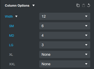
<div class="col col-sm-6 col-md-4 col-lg-3"><img class="img-fluid" src="wonnemar.jpg" /></div>
<div class="col col-sm-6 col-md-4 col-lg-3"><img class="img-fluid" src="wonnemar.jpg" /></div>
<div class="col col-sm-6 col-md-4 col-lg-3"><img class="img-fluid" src="wonnemar.jpg" /></div>
<div class="col col-sm-6 col-md-4 col-lg-3"><img class="img-fluid" src="wonnemar.jpg" /></div>
<div class="col col-sm-6 col-md-4 col-lg-3"><img class="img-fluid" src="wonnemar.jpg" /></div>
</div>
</div>
Now I am aware that the class col-xs-12 does not exist in BS 5.8.1 and if it is not defined it should default to col-xs-12, i.e. on a phone one column should cover the whole width of the screen.
But it does not. Instead 4 columns per row are displayed (and the 5th one shows up in the second row).
It looks like a bug to me.
If it is not, can anybody tell me please what is going wrong?
Henry