Hi,
I am trying to make a keyboard that is responsive. Right now I have a container that will hold multiple rows for my buttons that make up the keyboard.
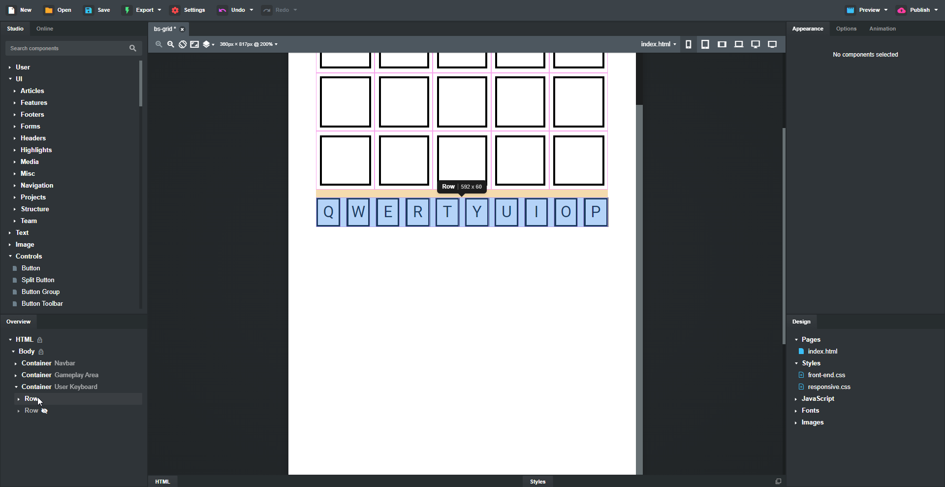
So far I’ve managed to make a row of buttons where each button has its own column that takes up 1 column of the Bootstrap grid. I’ve also used flexbox to center the buttons text and also centered and spaced the columns between the area of the row. So far I have this …
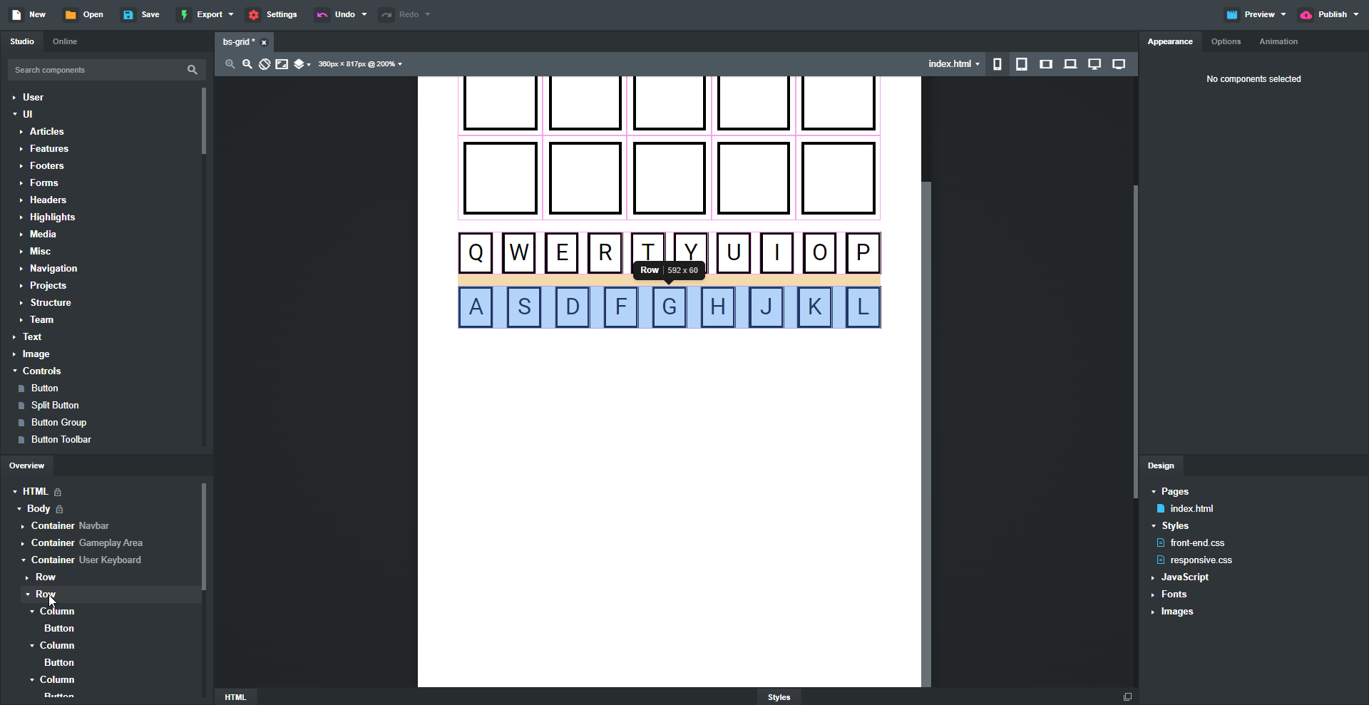
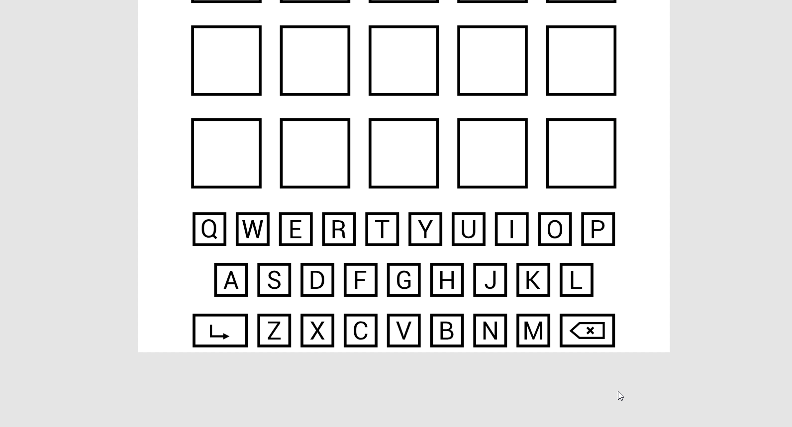
With the next row there is one less key than the top and so I end up with this …
What I would like to have though is the space between the buttons on the first row, match in the second row so that the keyboard actually looks like this …
What would be the cleanest way to do this whilst maintaining responsiveness?
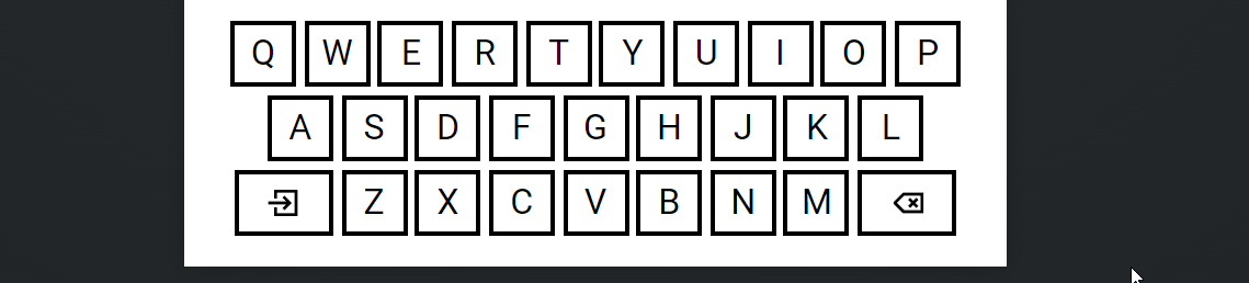
https://snippets.bss.design/vkey.html
Update: So I got a bit bored and changed the code to make it a bit cleaner which is now in the above link. Also added a bit of js to make it more ‘wordle’ like…
Hint… todays word is a popular framework we all know and love 
HTML:
 <section id="keyboard">
        <div class="kb-row"><button class="btn btn-primary" type="button">Q</button><button class="btn btn-primary" type="button">W</button><button class="btn btn-primary" type="button">E</button><button class="btn btn-primary" type="button">R</button><button class="btn btn-primary" type="button">T</button><button class="btn btn-primary" type="button">Y</button><button class="btn btn-primary" type="button">U</button><button class="btn btn-primary" type="button">I</button><button class="btn btn-primary" type="button">O</button><button class="btn btn-primary" type="button">P</button></div>
        <div class="kb-row"><button class="btn btn-primary" type="button">A</button><button class="btn btn-primary" type="button">S</button><button class="btn btn-primary" type="button">D</button><button class="btn btn-primary" type="button">F</button><button class="btn btn-primary" type="button">G</button><button class="btn btn-primary" type="button">H</button><button class="btn btn-primary" type="button">J</button><button class="btn btn-primary" type="button">K</button><button class="btn btn-primary" type="button">L</button></div>
        <div class="kb-row"><button class="btn btn-primary btn-wide" type="button">ENTER</button><button class="btn btn-primary one" type="button">Z</button><button class="btn btn-primary" type="button">X</button><button class="btn btn-primary" type="button">C</button><button class="btn btn-primary" type="button">V</button><button class="btn btn-primary" type="button">B</button><button class="btn btn-primary" type="button">N</button><button class="btn btn-primary" type="button">M</button><button class="btn btn-primary btn-wide" type="button">DEL</button></div>
    </section>
CSS:
#keyboard {
  margin: 5px;
}

.kb-row {
  display: flex;
  width: 100%;
  justify-content: center!important;
  margin: 10px 0;
}

.kb-row .btn {
  width: 9vw;
  height: 9vw;
  min-width: 9vw;
  max-width: 9vw;
  margin: .5%!important;
  text-align: center;
  font-size: 2vw;
}

.kb-row .btn-wide {
  width: 13vw;
  min-width: 13vw!important;
  max-width: 13vw!important;
}```
2 Likes
Thank you very much for the practical example. It led me to an ah-ha moment.
The keyboard I’ve made is strictly using Bootstrap components (container, row, column and button). Where the container holds the keyboard, the columns and buttons are held in a row, and the buttons are within their respective columns. To get each button spaced equally I used a margin class for each column and made each row d-flex with justify-content-center, this solution was my ah-ha moment based off the example above (can’t believe I didn’t think of this sooner as all buttons are centered in their rows, adding margin for spacing was the answer haha).
I set a min-width and height with vw for the buttons to maintain a 1:1 ratio (min-width is slightly larger for the function buttons). All columns within each row have a width of auto, I have an @media-query on the row for the keyboard to maintain responsiveness across all breakpoints.
I was stuck in a bit of a rut with this one (had been overthinking it for a bit too long) so thank you @richards for the fantastic example!
That update on the example is sick man! Awesome work! 
1 Like
Thanks, I was waiting for a job to come in so used it to fill the time, then ended up getting carried away 
@slipperybrick one thing that I noticed with a 1:1 ratio on the ‘keys’ is that on a mobile device it was easier with my fat fingers to type if they were slightly taller. It could be something worth testing.
Also I made a few more tweeks on the example that you might like 
1 Like
Oh man, that is awesome. I love the animation of the letters flying away, very cool stuff!
The yellow bar at the top looks very nice too, as well as the area with the keyboard and the icons in the function keys.
1 Like