You can change the text alignment on all your List Group items globally by selecting the List Group Component in the Overvew panel, then go to the Options panel > Text Options. Click the little arrow to open the Text Options. There you will see “Alignment.” Click the little arrow next to the word “Alignment” to expand the responsive options. Here you can set the alignment to be different at different screen sizes.
If you want to change the text alignment on individual List items independently, just select each List Group Item and follow the same instructions.
On a List Group, the font size is inhereted from the body CSS (in this case, font-size: var(--bs-body-font-size);) The default is 1 rem (which is approx the same as 16px in most browsers.)
There are multiple ways to change the font size on a List Group.
You can make the font bigger on the entire List Group by selecting it in the Overview panel, go to the Option panel > Text options > Font Size and picking a different size. (The lower the number, the larger the text.)
If this is not sufficient, you can change the font size to anything you want by selecting the List Group in the Overview panel, go to the Appearance panel > Font (click the little white arrow to expand the available options) and you can change the font size to anything you want. Let’s say you change it to 14px. This will apply an “inline” CSS style to your List Group. You will see it in the Attributes panel…
As well as in the Styles panel…
Next you need to extract this inline style to your custom stylesheet. You do this by going to the Styles panel and clicking the three vertical dots to the right of the element.style rule. Hover over “Extract Rules” and then select /styles.css (By default, anytime you make a new website project, BSS creates a custom stylesheet called styles.css)

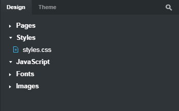
Now, go to the lower right of the program workspace to the Design panel. Expand Styles and double-click on styles.css.

You will see the styles.css stylesheet has opened up in the Styles panel with your extracted rule…

Because of how CSS works, this rule will affect ALL List Groups used in your website because all List Groups use the class .list-group. In order to make it so your new font size only affects this particular List Group, we can give the class a unique name and add it to your List Group component.
In the Styles panel, in styles.css, double click on the rule .list-group to edit it. Change the name to .my-list-group and hit enter.)
Now we have to add this custom CSS rule to your List Group. You do this by selecting the List Group in the Overview panel, go to the Attributes panel > Class Names, click in the Class Names field and type the name of the custom class my-list-group (no period used here.)
Now, only that particular List Group will have 14px text. If you add another List Group, you will see that it has the original default size text.
If you want the font size to be different at different screen sizes, you have to add an additional CSS rule with a media query.
Say I want the font to be 14px at the XS screen size, but 18px at the LG screen size. The way to do this is by duplicating the .my-list-group rule we just made, changing the font size, and adding a media query to the rule.
Go to the styles.css stylesheet, click the three vertical dots to the right of the rule and choose duplicate. Then you’ll see this…
Next, change the workspace display to the LG size…

Go back to the Styles panel and in styles.css, edit the second .my-list-group rule. Change the value of the font size from 14px to 18px, then click the three vertical dots to the right of the rule and choose Add Media Query. Now in your Styles panel, you will see this…
At this point, if you change the screen size to XS, you’ll see the font in your List Group will be 14px, and it will stay 14px at the XS, SM, and MD screen sizes. But when you change to LG, the font will increase in size to 18px.
This is one basic technique for creating responsive CSS in Bootstrap Studio. There are many other ways to write CSS so that rules affect some components but not others. You can also use IDs and other techniques. CSS is a very powerful language, and learning it allows you to do far more with Bootstrap Studio than if you only use the options available in the various panels.


