Hey everybody
I’m still in progress but i also need a little help.
Some of my text is pretty easy to read in SM mode but not in XS.
The first screen is SM and the second is XS
I’m looking the way to change the size connecting to the size on the customer experience.
You could add media queries for different font sizes at various widths.
or
h1 {
--min: 24px;
--max: 80px;
--scale: 15vw;
font-size: clamp(var(--min), var(--scale), var(--max));
}
so in this example, the minumum font is 24px and maximum 80px
1 Like
R.Omer
3
for bootstrap5 use fs-1 fs-md-2 etc
1 Like
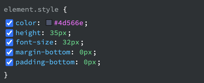
Thanks for your answers. I’m gonna try this but as a newbie, i’ll probably be back in a minute 
I’m back. Can you make me a screenshot please ? I got this in CSS panel
R.Omer
6
You do not any custom css for responsive text sizes in bootstrap5 unless your requirements are different
1 Like
Many ththings to learn again and again…
Thanks
1 Like