If I edit the site in one of these, will it be like that on only that screen save or will it be affected across the board
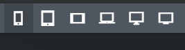
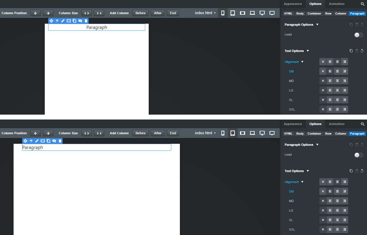
Those icons represent the responsive breakpoints (viewports) in the Bootstrap framework. If you change something on your site, it changes across all the viewports unless the component or element has breakpoint-specific options, and you change one of those options. So, for example, you can set a paragraph to be center-justified at the XS size, and left justified at the SM size, and the results will look like this…
Bootstrap is a “mobile first” framework, which means you should design your pages starting at the XS screen size (the one selected in your image,) and then change the layout and other elements as required as you view the site at each successively larger viewport.
I would highly recommend you thoroughly read through the program’s documentation, watch the videos on their YouTube channel.
Building one of their sample sites (for example, the Tesla website) together while watching the video will help you a lot in understanding how the program (and responsive design in general) works.