I assume this is a new website you are building for a client. I searched Google and found this page, which appears to be a work-in-progress…
This layout is definitely not done correctly.
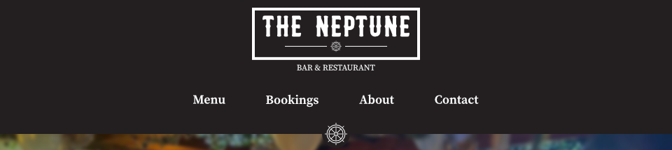
For desktop sizes, the Neptune Logo should be in it’s own separate container at the top… container > row > column, with the column set to “centered”, and the image itself should be set to responsive, and (assuming you want it to be clickable) placed inside a link, with the URL set to index.com.
Then, below this container, should follow the Navbar.
The Logo in the Navbar should be inside the “Brand” component (with the URL set to index.com) and then, using Bootstrap’s responsive display options, you would hide the top container with the logo on all screen sizes that are smaller than what you have Navbar’s expanded setting set to (ex. LG and Above.)
So if the Navbar Expanded option is set to LG and Above, then you would set the responsive display on the top Container to None and then set it to Block on LG.
At the same time, so that the Logo in the Navbar does not show up on desktop sizes, you would use the responsive display options to hide the Brand on LG (and XL as a natural conseqence.)
Ideally, if I were building this site, I would use an actual font for the words BAR & RESTAURANT (as opposed to making them part of the logo) so that they would be picked up by Google as part of the website’s SEO.
In fact, I’d create this entire logo using fonts and CSS, (even the ships wheel could be done with CSS and scaling.) This way, the name of the restaurant is also part of the page’s text, and hence readable by search engines. It also keeps the file size down, eliminates an image, and speeds up page load.