Static background behind the page content

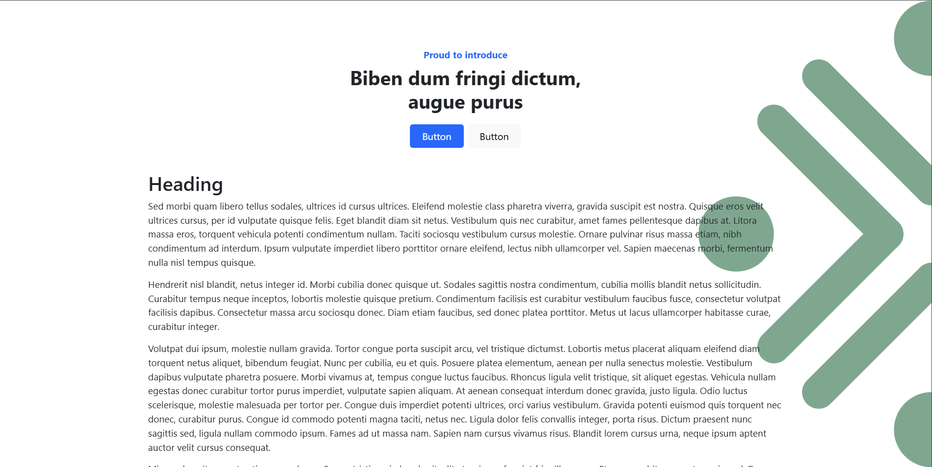
I am trying to implement a stationary logo graphic behind the page’s content.

The image shows what I am trying to achieve with the faded green logo on the right-hand side of the page. The information is so dull I am attempting to at least give the visitor something to “see” other than only the formatted text.

Thank you,


-K

So, this is done with CSS. Is there no way inside BSS to do this same thing?

Also, is it possible to keep the image sticky to the center/right of the viewing screen? Your example keeps it to the top/right.

There is a way to do this without writing your own, or as much custom CSS. It’s always best to utilise the Bootstrap CSS framework so you don’t need to write as much of your own CSS and reduce the size of your site.

I will attempt to get my solution over to you tonight :slight_smile:

You can achieve this using Bootstrap 5 utility classes alone, but there are some limitations:

Equivalent Bootstrap 5 Utility Classes:

<img src="your-image.png" class="position-fixed top-50 end-0 translate-middle-y opacity-50" alt="Logo">

Explanation of Classes:

  • position-fixed → Fixes the image in place (relative to the viewport).
  • top-50 → Moves the top edge of the image to 50% of the viewport height.
  • end-0 → Positions it at the right edge.
  • translate-middle-y → Translates the image up by 50% of its own height, ensuring vertical centering.
  • opacity-50 → Sets the opacity to 50% (adjust as needed).

Limitations:

  1. You cannot dynamically adjust the size (width and height) using only Bootstrap utility classes. You’ll need custom CSS or inline styles for that.
  2. If different sizes are required at specific breakpoints (e.g., 25rem for md screens), you’d still need a media query.

It is generally easier for the browser to find and apply one custom CSS class than multiple utility classes.

Here’s why:

:one: Performance Considerations

When the browser processes CSS, it matches selectors to elements in the DOM. The fewer selectors and the simpler they are, the faster the browser can render the page.

Custom CSS (Fastest)

.logo-right {
  position: fixed;
  top: calc(50vh - 6.25rem / 2);
  right: 0;
  width: 6.25rem;
  height: 6.25rem;
  opacity: 0.4;
}

:white_check_mark: Pros:

  • The browser only has to match .logo-right once.
  • No extra lookups are needed for multiple classes.

Bootstrap Utility Classes (More Work for the Browser)

<img src="your-image.png" class="position-fixed top-50 end-0 translate-middle-y opacity-50">

:rotating_light: Cons:

  • The browser has to match multiple classes (position-fixed, top-50, end-0, translate-middle-y, opacity-50).
  • Each class requires a separate lookup in Bootstrap’s CSS file.
  • More classes = more parsing and rendering work.

:two: Readability & Maintainability

  • Using a single .logo-right class makes your HTML cleaner.
  • Too many utility classes can make the markup harder to read and maintain.
  • If you ever need to change styles later, it’s easier with a single .logo-right than modifying multiple Bootstrap classes.

:three: File Size Considerations

  • If you use the full Bootstrap CSS file, the browser must download and parse all Bootstrap styles, even those not used.
  • If you use only a few utilities, your HTML grows larger with many classes.
  • A custom CSS file can be optimized (especially if you only use what’s needed).

Final Verdict – Which Is Best?

Factor Custom CSS (.logo-right) Bootstrap Utilities
Performance :white_check_mark: Faster (1 lookup) :arrows_counterclockwise: Slightly slower (multiple lookups)
Readability :white_check_mark: Cleaner HTML :x: Cluttered with many classes
Maintainability :white_check_mark: Easier to update :x: Harder if you need to change styles across pages
Flexibility :white_check_mark: Supports calc() and media queries :x: Limited to Bootstrap’s predefined utilities

Overall, for performance, readability, and maintainability, a single custom class is better!

I have to say, your responses as of late have a very ChatGPT vibe to them :thinking:

Is there a permanence overhead to using utility classes, yes. However, it is so tiny it’s quite honestly not worth considering. It’s become so little of an issue now that utility first CSS frameworks like Tailwind use only utility classes.

Utility classes have the advantage that you can use them on multiple elements, and if you are using a CSS framework it’s best practice to use them.

I also disagree about readability, a class called position-absolute is far easier to tell exactly what it does than class-name-here. And I would say it’s easier to maintain.

There is far more of a noticeable overhead to having multiple CSS style sheets. Especially if you are loading multiple large ones.

Here is the solution I came to utilising no custom CSS. This uses just Bootstrap classes.

This is achieved by adding an image to the page and giving it the following classes: position-fixed top-50 start-100 translate-middle h-100 z-n1 opacity-50

HTML:

<img class="position-fixed top-50 start-100 translate-middle h-100 z-n1 opacity-50" src="logo.svg" />

I created this SVG since it scales well on different screen sizes without getting pixelated.

<svg width="3218" height="3223" xmlns="http://www.w3.org/2000/svg" xml:space="preserve" overflow="hidden"><defs><clipPath id="a"><path d="M591-374h3218v3223H591z"/></clipPath></defs><g clip-path="url(#a)" transform="translate(-591 374)"><path d="m2200.5 1550.5 779.53 779.53m-780-779.53-779.528 779.528M2510.5 1238.03l779.53-779.53m-779.53 779 779.528 779.528m-1089.998-1092L1420.5 145.5m780 779.528L2980.028 145.5m-1088.998 1092-779.53 779.53m779.53-779-779.528-779.528" stroke="#13501B" stroke-width="229.167" stroke-linecap="round" stroke-miterlimit="8" fill="none"/><path d="M591 1237.5C591 1094.18 707.406 978 851 978s260 116.18 260 259.5S994.594 1497 851 1497s-260-116.18-260-259.5m2698 0c0-143.32 116.41-259.5 260-259.5s260 116.18 260 259.5-116.41 259.5-260 259.5-260-116.18-260-259.5m-1349-1352c0-143.318 116.41-259.5 260-259.5s260 116.182 260 259.5S2343.59 145 2200 145s-260-116.182-260-259.5m0 2704c0-143.32 116.41-259.5 260-259.5s260 116.18 260 259.5-116.41 259.5-260 259.5-260-116.18-260-259.5" fill="#13501B" fill-rule="evenodd"/></g></svg>
1 Like

I was able to convert my logo into an .svg file format - after I try this will you be able to explain “bumps” I may hit?

I agree with your ChatGPT comment - for some reason its output shares a ton of section icons! I know this because I use it for my day job.

1 Like

Sure, you can leave a comment here or message me directly and I’ll be happy to assist when I’ve got a moment :slight_smile:

@catkin
With your setup, the image will be wider than the viewport on mobile phones. I guess you don’t mind that.

Thanks for spotting that, I’ll have another look at it! :slight_smile:

I can’t remember if it showed for me…

catkin - Your solution worked like a charm. Thank you!

1 Like

@kuligaposten,

I noticed that after this thread and the above comment, many of the exceptional posts on your site / blog sadly disappeared. Which is a real pity as they were very nicely done and highly informative.

Your content here on the forum is certainly some of the best and most detailed advice being offered and assuredly benefiting many.

1 Like

@bss_user

I wanted to add HTMX for pagination so that, instead of a full page load, only the cards update when clicking the pagination links. My first attempt caused the site to crash, of course. I rolled it back to the previous deployment, which is why some posts were missing. It’s fixed now, and HTMX is doing a great job by preventing a full page reload.

2 Likes

HTMX is awesome! I have used it on a few projects, you should really post a Showcase of the new site when you can