I'm adding this as a new proposed idea, since the old post seems to be acting a but wonky.
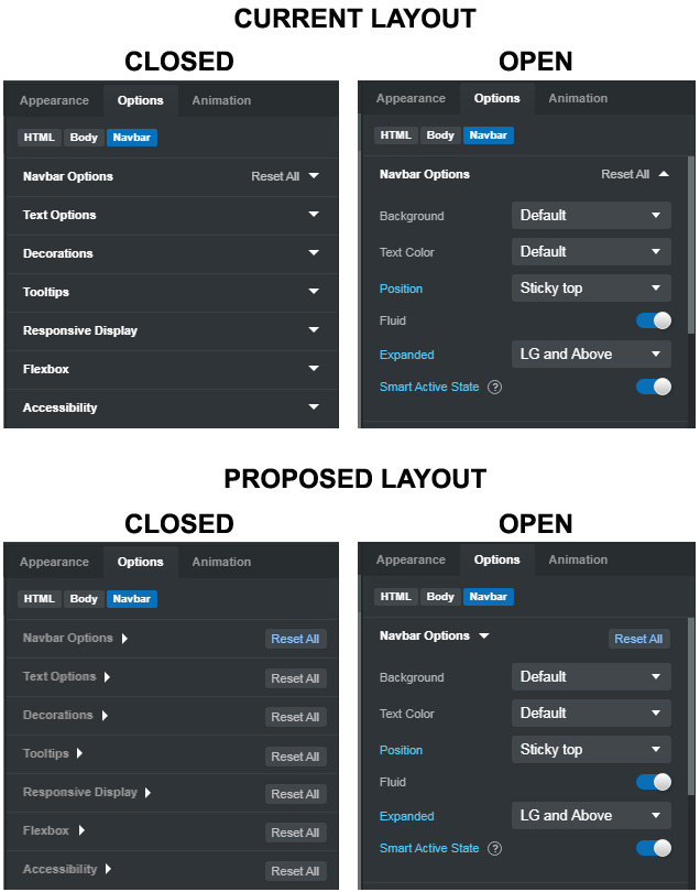
To reiterate, we want to keep the KEEP the "reset all" feature, but move the arrow to the left so it sits right after the particular heading of options that are shown when the arrow is clicked. I've created an image of my proposed changes...
The various options should all be slightly gray unless opened
The arrows should move to the left, so they come right after the Option in question, and should appear and function like all the arrows on the sub-options. CLicking either the text or the arrow would open the menu.
When an option panel is open, the Option title should turn from gray to white, indicating it's "actively being used."
The "reset all" text should become a button with text, and always appear on the right side of the Option menu, whether it's open or closed
The text in the reset all button should turn blue whenever any of the Options in that menu have been changed from their stock settings. Otherwise it should remain gray.
We should be able to reset all the Options by clicking this reset all button, even without opening the Options menu.
This way, at a glance, one can tell which Options have had changes made even without opening the panel. The "reset all" is not a clear button, and a good distance from the arrows, so there is no accidental clicking when trying to expand the Options. The small arrows next to the Options are now consistent with how all the other arrows work in the program, and the colors of the various bits of text are also inline with the other aspects of the UI.
Lastly, it would be nice if there was a right-click setting at the very top of the main Options tab, that allowed one to expand-all / collapse-all.
I must have totally missed this post because this would be some great additions to the app to help us know when there are settings changed from the default.
Moving the arrows does make sense. I am adding it to our todo.
Having the Reset All always visible introduces visual noise. Users will need to discern the color to find what can be reset. A link like the one we have now is easier to spot I think?
If we make the labels gray when collapsed, it would make it difficult to read (people complain of low contrast even now). We can tweak it a bit, but then the effect won't be as prominent as the mockup.
I think that a right-click setting on the main Options tab would be undiscoverable. Maybe we can add a command to the palette for resetting all options. Not sure if it would be easier to find though.
I guess the the Reset All doesn't always need to be visible (or necessarily need to be in a "button" format.) as long as it's visible when any of the settings have changed from their defaults (which is how it is now.) Having it change to blue would be in keeping with the manner in which the individual items change to blue when they're modified from their defaults. Just UI consistency.
My main concern is getting it away from the expand/collapse arrow because the two things are so close that it's easy to hit the reset all text when one simply wants to expand the panel. Putting Reset All in a button just makes it clearer to see where the mouse click will have an effect. I don't even use the Reset All button very often, but it has its uses. I agree that a right-click setting would probably not be noticed.
The gray/white text is, again, just an effort to keep the UI uniform. When panels are selected, their titles go from gray to white. When settings are changed, the text goes from gray to blue. It just seems like unselected = gray, selected = some other color.
I personally have no issues with the contrast, but maybe looking at the program on a 17" laptop screen is different from a 24" desktop monitor.