gilmar
October 18, 2021, 3:27am
1
@media (min-width: 992px) {#hero {
@media (max-width: 720px) {#hero {
You could simplify this by putting mobile first:
#hero {
  background: url(“small.png”) center / auto no-repeat;
  height: 300px;
  padding-top: 500px;
}

@media (min-width: 992px) {
  #hero {
    background: url(“big.png”) center / auto no-repeat;
    height: 680px;
    padding-top: 180px;
}
1 Like
jo-r
October 18, 2021, 12:44pm
3
Also keep in mind that from Bootstrap 4+ your styles should be ordered from smallest to largest. This post explains it better since I had to ask too. My confusion came from working with both BS 3 and 4 and now 5 and I kept going back and forth a lot for some clients and it just messed me up lol
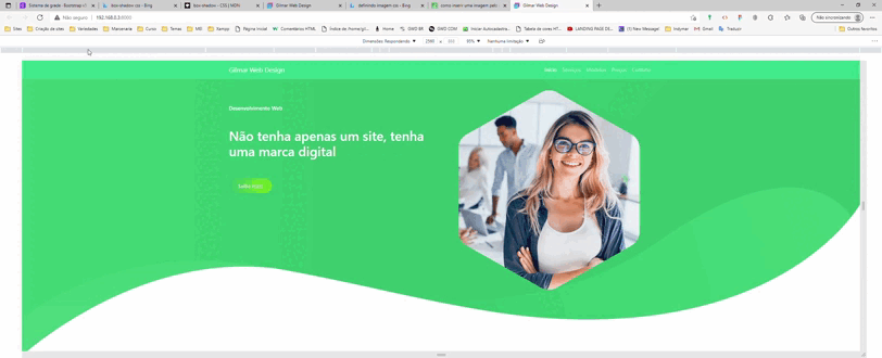
Using Media queries for placing an image in an absolute position (thankfully not many sites have me do this, but this one has quite a few I will need to work with). I had to remove the default phone size setting as it kept overriding the rest no matter what I tried. But, after I did that I had to rearrange the 3 media queries from small to large order in the CSS file. Typically it’s been default XS size at the top and then from XXL to XS beneath it.
Anyways, I’ve never had to rearrange them …
1 Like