Three questions 2 on working with the nav bar

I posted this as a sample site I am working on, you can see it here.
https://panama-work.bss.design

I have a lot of pages already ready to go. Many of them are just a copy of one right now I need to change but I have them all linked together, working.

Is there a way to add a new menu item in one page and have that new menu item show up on all the pages in the menu so I don’t have to go to every single page and recreate it?
Same thing with the footer. Over time I’ve got some things that need to be changed. Over time, the site will expand much larger with more and more pages and blog post pages.

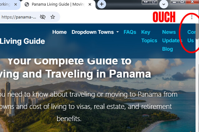
For the nav bar, I need to add in two more links.

Also for the nav bar I don’t understand I watched the video on how to have the current item for the page you’re on selected in a different color I can’t seem to figure out how to do that.
Also in the video tutorials it says watch some of the other videos that well they have never been made yet it looks like.
So maybe the current page could be in a yellow text link and the other pages could be in the light blue color I have.
I see I did not make them all blue, some are white, so I guess I’m going to have to go back to every single page and change that as well unless there’s a way to do this in one place. It goes across all pages.?

I’m planning on using the blog feature for a second area where I’m instead of bringing up blog posts it will bring up some pages into a page displayed like a blog post for people to click on. Looks like that won’t be a problem the way this works. That would be one of the newer links that I need to create in the menu system.


On the blog page, I can’t seem to figure out what setting to use to control the background behind the blog area. If you look at it now…It has a little bit of a blue area coming down behind the blog post loop. I think that whole blue area should be behind the whole entire blog area.
I think I have something set wrong that’s controlling the area that the blog loop is showing up in that it’s not working like it should.
I had to change some settings because the row of the three blog items were actually over the top of the footer so I had to change something to leave some space but I think if it adds another row of three they’re going to go down on top of the footer area.

There are overflow issues with your navigation menu as you reduce the browser width. I haven’t looked at the code, but my guess is you’re overriding some aspect of Bootstrap’s built-in responsive behavior and/or using the Options > Text Options > No Wrap setting on your navbar links. You can use flexbox settings on the navbar to have the links wrap to a second line, rather than “stack” and overflow the page.

When building your website, you want to always check how the responsiveness behaves across all the screen sizes, from mobile (300 px) to tablets, laptops, and the largest desktop you want to support. You can do this within BSS, or use Chrome F12 Developers tools on a preview of your website page, and use the responsive option to simulate any device screen width.

Take a look at this website and the Navigation Menu. Shrink the browser width and you will see what I’m talking about in terms of how the links wrap, and do not stack.

I think I have this fixed now on the home page. It goes to the hamburger menu now.

Is there not a way that I could fix this in one place and it applies it to all menu items on every page? Because it’s not fixed on all the other pages by fixing it in one area.
This is a massive amount of pages to keep needing to fix the menu for or to be adding a new menu item to every time.This site will expand out quite larger over time with more menu items needing to be added, like more towns and so on..

Is there not a way to have a global top menu bar that when you change that it applies to all the pages?

Now whatever I did on the homepage, the big mega drop down menu no longer works. I didn’t even highlight that area.

I reverted it back and then changed it. I think I have the drop-down menu working again.

Of course. This is how your website SHOULD be setup. The navigation menu should be a linked object on every page of your website…

Hi, yes, I have all that working now connected together. I’ve learned quite a few things to do and ways to make things work. Really opened up a lot of possibilities.

The three things I would HIGHLY recommend you do, which will save you a lot of headaches and asking lengthy questions in the forum are as follows…

  1. Fully read all the Bootstrap Studio documentation, and where possible, try out the things shown.
  2. Watch all the Bootstrap Studio tutorial videos, and practice building one of the websites along with the video (this was how I first learned to use the program)
  3. Read the official Bootstrap documentation. While a lot of it is not applicable to using Bootstrap Studio, understanding how Bootstrap’s grid system (flexbox) works, and especially understand all the utility classes, will make your website development VASTLY easier.

Knowing and using Bootstrap’s utility classes is one of the most powerful tools you can have in your website toolbox. They can save you a ton of time and avoid the need to write custom CSS. Whenever you use the Options panel in BSS, you are essentially adding Bootstrap’s utility classes to the various Components. The options panel is powerful, and gives a ton of freedom with the breakpoint-specific settings, but it’s also limited to what the developers have put in it.

Here’s an example. One of the things I hate about Bootstrap’s modal Component is the header layout, and the way the close button is placed in the layout. By default, the modal header is a flexbox element. It has a heading and a close button. The heading is always aligned to the left. So if you want the text to be right in the center, it’s a pain in the butt. You can mess with the flexbox settings on the header via the Options panel and position the elements to the close button is first, the header is second, and you can center the header text with flex rules, but the close button will take up the full width so the text will be too low.

Using utility classes, you can simply and easily take the close button out of the flex layout, so the text is free to behave like a normal text block in any ordinary layout.

Select the close button and add these utility classes via the Attributes panel:
position-absolute top-0 end-0 m-1 (if you want the “X” closer to the top and right, use m-0)

Then select the heading and add the utility class: w-100

Now you can use the regular text alignment tools on the heading, and it will be DEAD CENTER in the modal header, and the close button stays out of the way. If the text happens to flow into the close button, you can just add something like px-3 to the header and that will prevent the text from colliding with the button. You could even use some CSS on the close button to make it smaller ( example: transform: scale(.8); )

Lastly it’s extremely helpful to learn CSS and how to write it. W3 Schools is a good place to start. You can also learn Bootstrap at W3 Schools. Not being able to write CSS limits you to only the tools available in Bootstrap Studio. Bootstrap Studio is an amazing program, and you can build incredibly lean, fast, efficient websites with it, but you can also create disastrous messes with hundreds of inline CSS rules if you do everything through the Attributes panel (which is what a lot of beginner do because they don’t know any better.)

It’s kind of ironic that BSS’s Check for Issues tool complains about inline CSS, when that is the default way that BSS styles elements if you use the Attributes panel. Most people do not realize that you need to extract inline rules to external stylesheets, or why this matters.

1 Like