Hello 
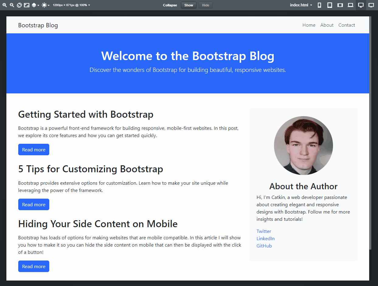
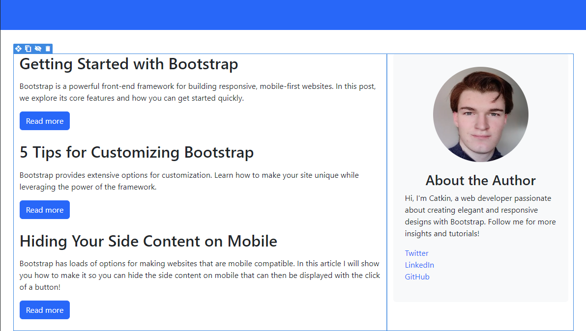
In this quick tutorial I will show you how to use Bootstraps collapse content element, and responsive display classes to create a really clever layout for mobile devices. This layout is especially useful for layouts where you have some secondary content on your site that you want people to see, but isn’t super important to always be displayed on smaller screens. You can see an example of this layout below!
Setup 
First you will want a layout with too columns, one with your main content and the other with your secondary content.
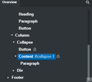
Once setup, search for the collapse element in the left hand panel in Bootstrap Studio. Drag this into your right hand column, above the content you want to hide on mobile.

If you expand this element you will find there is a paragraph inside, you will want to delete this and replace it with the content you want to hide inside it.
Now that you have your content inside the content div it will be hidden from the screen. Now we want to setup the mobile layout so its only hidden there.
Mobile layout 
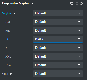
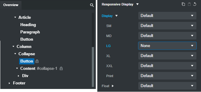
Keeping your mouse selected on the content div from the Overview panel, go to the Options tab on the right hand side of the screen. From here, expand the Responsive Display category, and then inside there expand the Display options.
With that now done, next to LG choose from the dropdown block this will cause our collapse content to be shown on LG screen sizes and up.
Next, you will want to choose the Show Content button, open its settings and this time, choose None from the Responsive Display category.
This now finally hides the Show Content button on laptop and desktop layouts.
Finishing touches 
The last finishing touches are optional since it depends on how you want to lay out your website. But here is what I do next.
While still selecting the Button that collapses the content, I add the class w-100 this makes the button the full width of the column.
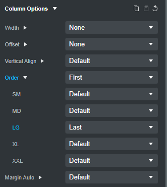
Next, I choose the column that holds my extra content and I open the Options tab and then I go to Order, expand the Order options and setup the following so that my column is shown first on mobile.
Now that should be you all setup! Hopefully you find this useful! I also have a video version of this available to watch here.