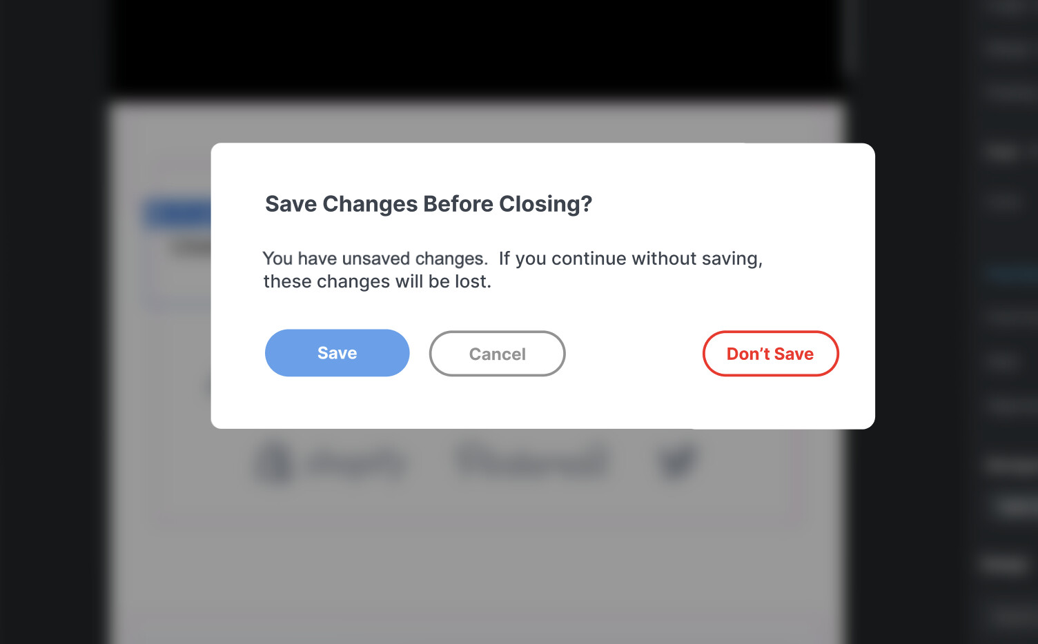
When you close the program with unsaved changes, the Primary button leads you to close without saving. Not only is this a dangerous action (leads to lost work), but it’s not what we want to do most of the time. It’s common to be done with work for the day, close the program, and simply have forgotten to hit “save.” We should not be lead, via the primary colored button, to do a dangerous action by default.
Much better would be to do what many other programs do, and have the primary button be “save and close.” This lets you go ahead and close the program like you wanted to, while being helpful (“oh yeah, I guess I forgot to save it recently, thanks for prompting me to save, BSS”). Instead of “oh shoot I almost clicked that primary button and would have lost who knows how much work because I guess I forgot to save recently – why you trying to make me lose work BSS?”