Quickly looking over your website code, I don’t see any glaring errors that would suggest AI is incapable of coding a functional page. But what I do see (or maybe it would be better to say what AI does NOT see) are numerous UI choices that I, as a developer, would immediately consider to be problems. AI completely ignores them because it’s not a human actually LOOKING at your website.
Please take this as constructive criticism. I’m not trying to tear your website apart, but rather help you understand why it’s so important that human eyes not only look over the code, but look over the actual pages at all different screen sizes and USE the website…
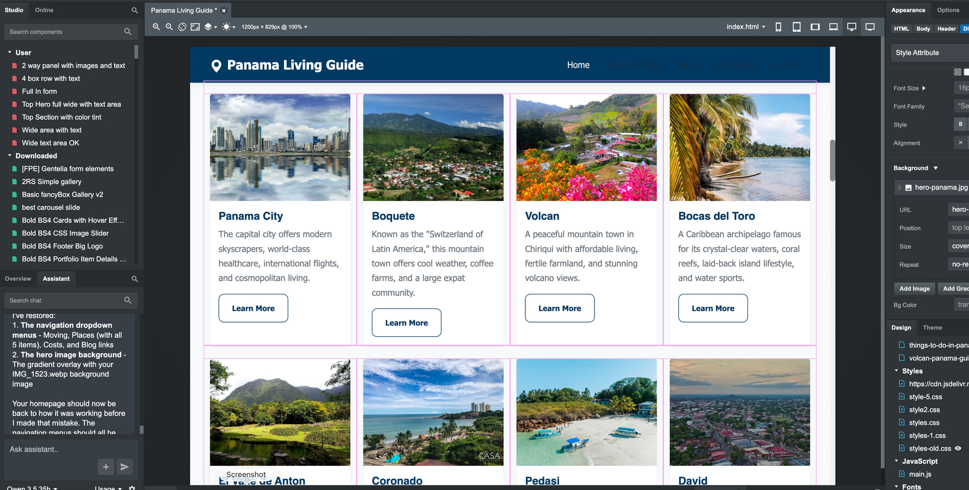
There are layout issues on your website that an AI just simply cannot see. Foremost… when I look at your home page on my phone, the brand text in your navigation menu (Panama Living Guide) is so long that it causes the hamburger menu icon to jump down to a new line, which then causes the Navigation to partially block the first line of text on your home page. This is a significant layout issue to which AI simply won’t alert you.
A website targeting (potential) retirees should be focused on WCAG compliance. This is something to which AI is oblivious, but a human auditor would immediately see it. Your navigation menu uses an inline (undesirable) CSS rule to set the font size at 12 pixels. As someone who is approaching retirement age myself, I already need reading glasses to use my phone. Sure, I can zoom the screen or increase the scale via the browser, but 16 pixels is generally considered the minimum font size for websites in terms of best practices. Also… light blue text on a dark blue background is a questionable choice, considering your visitors may not have the greatest vision. These are things AI just can’t catch.
Your hamburger menu… the svg lines that are almost black on dark blue make them very hard to see. Even for someone without visual impairment, it’s hard to tell this is a menu. For someone with visual impairment, they might miss it completely.
Your buttons…
.btn:hover {
transform: translateY(-1px);
opacity: .96;
}
Why? A one pixel shift is so minute that it ends up feeling more a UI aberration than a conscious design choice. And changing the opacity from 1 to .96 does virtually nothing. If this was the AI’s doing, it makes no sense. If it was your choice, why didn’t the AI alert you as I did? Answer: because AI doesn’t know any better.
Your towns… When I go to the pages, your navigation menu is blocking the yellow badges that have the regions listed. Why doesn’t AI see this? Because it can’t.
Your FAQs accordions… maybe this was a conscious choice, but once one is opened, there’s no way to close them fully without reloading the page. Not sure if this was AI’s doing, or something else.
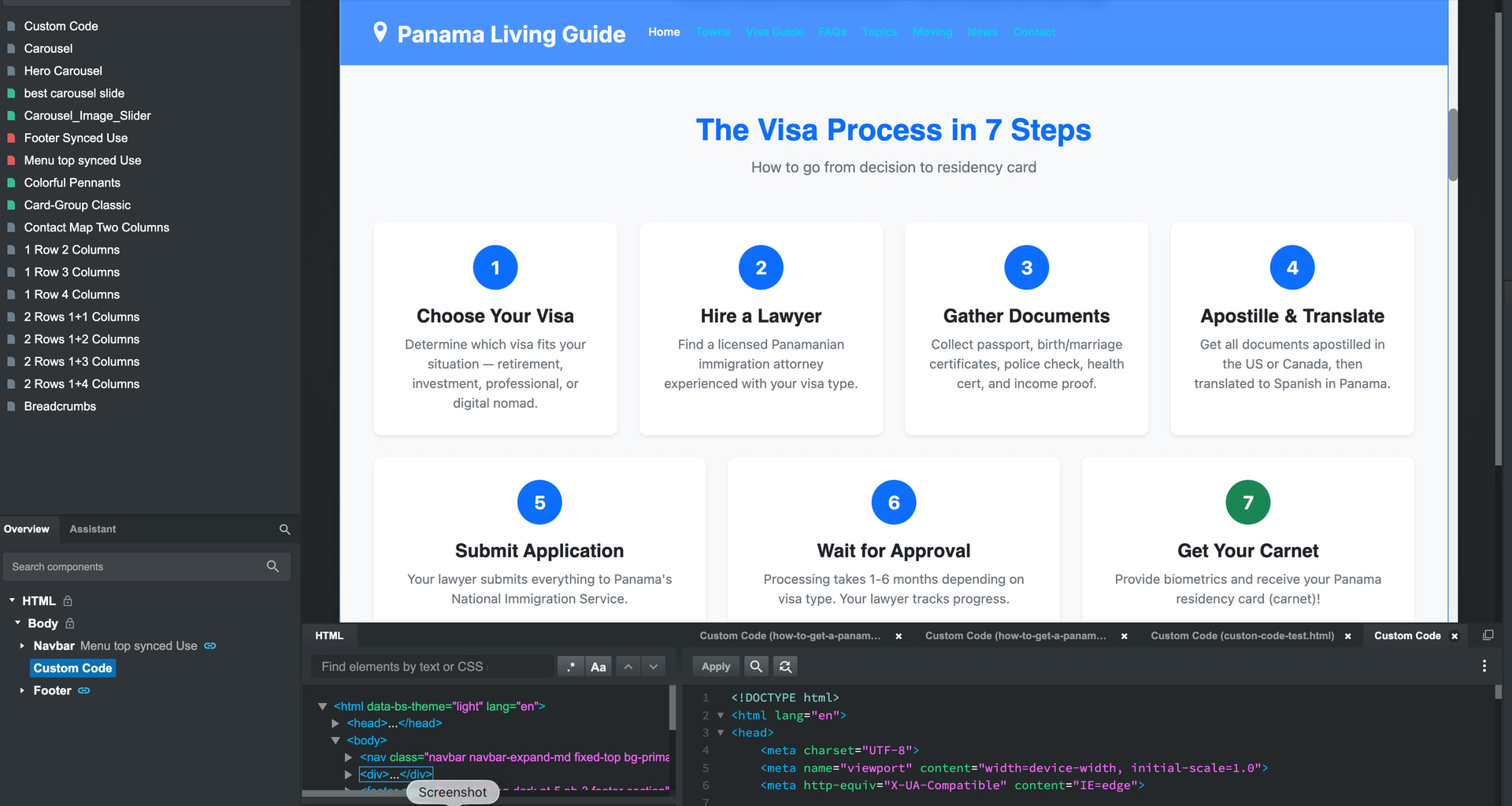
Your More Pages link… on this page you have a series of links across the top with 10 pixel text in them. This is way too small even for people with good vision.
Explore Key Topics… I presume these will eventually be links to guides, and are still a work-in-progress. If not, they’re not working. And again, I question the font size (14 pixels) and even the color. --bs-secondary-rgb: 108, 117, 125; on a white background this doesn’t have enough contrast to pass WCAG. This is why your Lighthouse score (91) is taking a hit. AI doesn’t understand this, which further illustrates why leaving development in its hands is risky.
There are other issues throughout the site that would detrimentally affect visitors using screen-readers. Lots of links have no titles or aria labels. Images are missing alt tags. Again, this is important when you’re building a website that will likely be visited by elderly people who may have vision impairment. This website may be helpful.
The head section is a bit of a mess. If AI did this, it didn’t do a good job. The stuffed keyword tag is completely unnecessary. Google has ignored meta keywords for over a decade. You’ve got the exact same jpg icon repeated four times. styles.min.css is called twice. ionicons.min.css (via CDN and local assets) is called three separate times.
There are tons of inline styles that should be moved to external CSS stylesheets. AI should not be writing inline CSS, but if it’s looking at your code, it’s also failing to alert you to this. Inline CSS is a maintenance nightmare down the road.
You’re calling a JS file named smart-forms.min.min.js. I see that the file is valid (despite the improper .min.min naming convention) so I must ask why is min duplicated? Was this the result of AI generation, or just a typo? I’ve made typos like this myself, but this is the sort of thing that an AI actually would complain about if it audited your website.
Again, I’m not trying to discourage you. I hope this post helps you out.