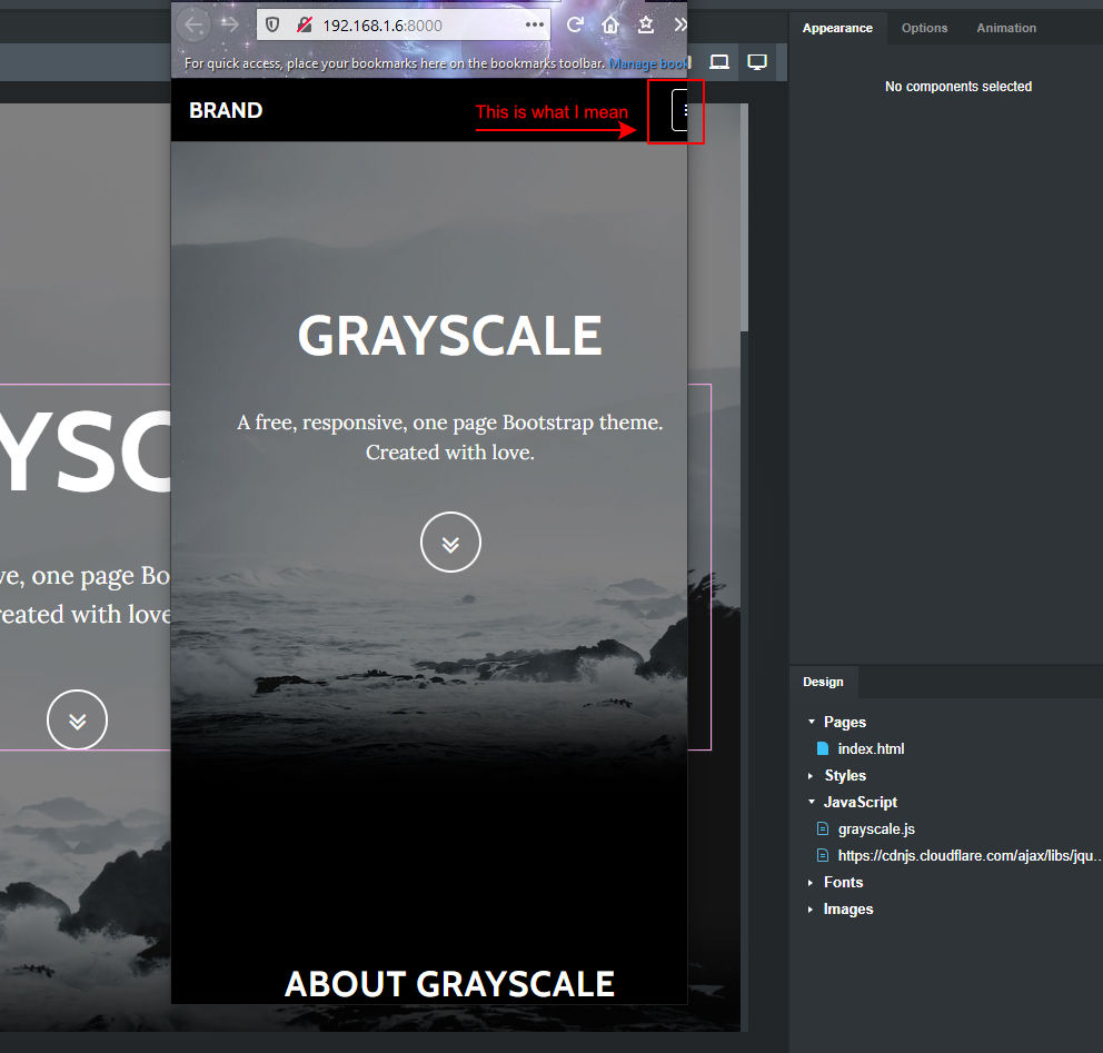
I have the latest BSS 5.5.1 & just opened a completely new Greyscale project and noticed the hamburger menu is inaccessible and off to the right when previewing in browser in small browser mode, also checked a few other themes & they are the same (No modifications just new and preview).
I have posted in bug report but was hoping sombody would have an answer here.
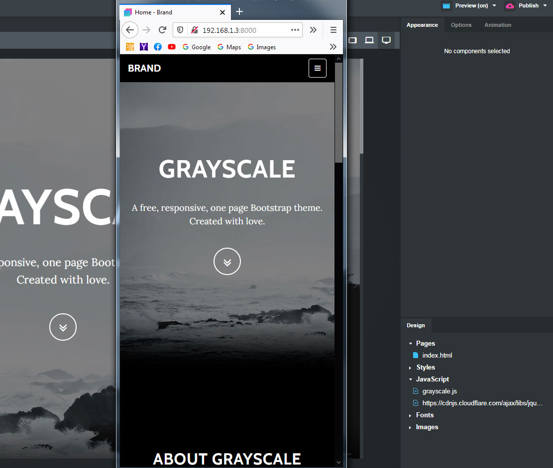
I could not reproduce this on my system. I see a white hamburger menu in the normal, upper right location when at SM or XS breakpoints.
Windows 7x64. BSS 5.5.1. Latest version of Chrome.
What O.S. computer and browser are you using? Have you tried clearing your browser cache? That’s often the culprint with strange issues like this. In Chrome, right click anywhere on the page and choose “inspect” to open the Developer tools. The go back up to the refresh page icon (circular arrow button) in upper left menu of the browser, right click it, and choose the last option from the drop-down menu that appears - Empty Cache and Hard Reload.
I was wondering about the cache issue also as I did see it to begin with and then after closing Bootstrap Studio and restarting it suddenly began to work correctly. I still have another theme that does not seem to work as described and I cannot seem to reset that with a restart ?
Did you clear the browser cache? If Chrome is loading some mucked up CSS with the same class names, but different values, that could cause this sort issue.
What computer, OS and browser? Need complete info to try and diagnose the problem.
I also don’t the scroll bar on the website preview (unless Windows 10 removes vertical scroll when the window is not focused on by the mouse. I seem to remember reading somewhere that they’ve made that a “feature” (which makes zero sense to me, since it takes a way the visual cue that there’s more to be seen below the fold.)
I can only guess this is a Windows 10 issue, since it’s the same website, the same version of BSS, and the same browser. Can you publish this website temporarily on the web so I can see if the published version looks incorrect? If if still shifts the menu off screen, that would suggest an issue with site code. If it look right on a published site, then we’ll know it’s an issue specific to your computer and/or browser. At that point, I’d consider doing a reset of Firefox back to factory defaults, or a full reinstallation.
Also, check the preview in some other browsers (Chrome, Edge) and see if the menu is still off. That will further indicate it’s a Firefox issue.
Cool printninja, yep it’s only started happening since I checked today and just updated Firefox today. It was okay a week ago when I checked in old version and everything was okay then, so I believe your right with the Firefox issue, thanks again.
Have your small device’s browser set to show the scrollbar always and that should fix the issue. Looks to me like the scrollbar didn’t activate which means it didn’t push things over like it should. Just guessing here.
So for me it was happening in Chome 87.0.4280.88 on Windows 10 and also the latest Edge Browser. Did not happen in the latest Firefox.
I believe it is related to the browser emulation mode settings as you can see by your pic that it is zoomed. Resetting both chrome and edge to default settings in the device emulation screen (3 dots) top right corner "reset to defaults seemed to solve my issue but cannot be sure why.
After extensive experimentation with some form issues I had with my form company last week, I have come to the conclusion the the mobile emulation modes in desktop Chrome and Firefox are just emulations of the viewports. They do not accurately reflect how the actual mobile phone browsers or their various operating systems render the websites. So you cannot rely on desktop emulation as a guarantee of how your website will look on a given phone, under a given O.S.
When I build my websites now, I have my own mobile phone on my wi-fi network, and I open the phone’s browser and set the URL to the local I.P. address that Bootstrap Studio uses to preview websites on my computer (in my case it’s 192.168.1.3:8000)
By doing this, I can accurately see what the website looks like on a real mobile display.