Having a difficult time getting a column to have display:none when on mobile. Once the column is selected, under Responsive Display menu, I set SM to none. Then I set the breakpoint button to SM, the column is displayed, but at all other breakpoints, it is gone. This is the exact opposite of how I think this should work. What am I missing? al other b.p. are set to default. Thx.
That’s because SM is not mobile. XS is mobile. Because Bootstrap is a mobile-first framework, the first setting in any Bootstrap Studio menu that offers breakpoint-specific options is considered the mobile (XS) setting - even though it doesn’t read XS (it probably should.)
This is not explicitly mentioned in the docs, or visibly intuitive when you look at the BSS user interface.
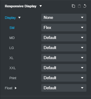
So to have a column not visible at mobile (XS), and visible above it, you need to select your column and set your Responsive display options thusly…
First of all, this is a precise, timely, and incredibly useful response. Thank you! 
Secondly, yes, XS is mobile. But I didn’t see XS in the tool’s menus or in the docs, so I thought I’d see if a comment would surface that would address this. And it did!
Once again, thank you.