When answering this question for a new user, it occurred to me that the UI is not visually intuitive when it comes to the XS breakpoint.
Those of us who are experienced BSS users know the first dropdown menu in any option that has responsive breakpoint settings is the XS (mobile) size, but for new users, this is not visibly intuitive. Nor does it seem to be mentioned anywhere in the documentation (though I think it’s explained in the tutorial videos.) I think I figured it out myself, but I can see how some new users not familiar with BSS or Bootstrap could have difficulty with this.
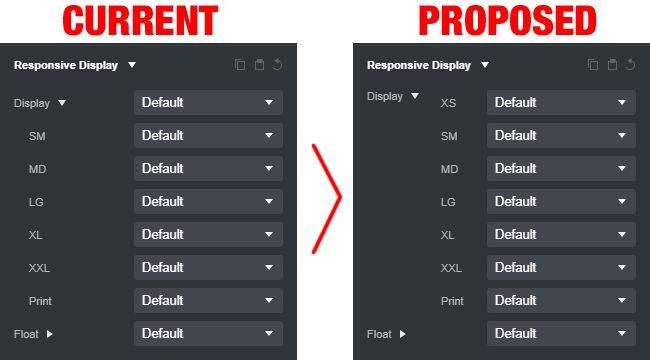
I propose a simple change to the UI would fix this, and make it very clear that the first setting is the XS setting. Just move the breakpoint sizes over, and add XS next to the first one, thusly…
Hello. These are the little details that make the best software.
I am always in favour of interface improvements.
I have only been using BSS for a few months and I am really amazed by the quality of this great software.
Adding “XS” will indeed lead to confusion since it existed in the Bootstrap 3 days. Maybe we can add a help tooltip to these options which explains the logic behind the dropdowns and what the default is.
If you hover the mouse over the smallest (mobile) icon in the upper right of the top menu, the tooltip that pops up reads “XS” so the program sort of acknowledges mobile as the XS size. But I also understand the point that there are no XS utility classes in the current version Bootstrap. Not sure what the best solution is.