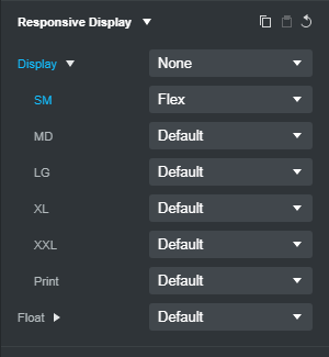
That’s because SM is not mobile. XS is mobile. Because Bootstrap is a mobile-first framework, the first setting in any Bootstrap Studio menu that offers breakpoint-specific options is considered the mobile (XS) setting - even though it doesn’t read XS (it probably should.)
This is not explicitly mentioned in the docs, or visibly intuitive when you look at the BSS user interface.
So to have a column not visible at mobile (XS), and visible above it, you need to select your column and set your Responsive display options thusly…