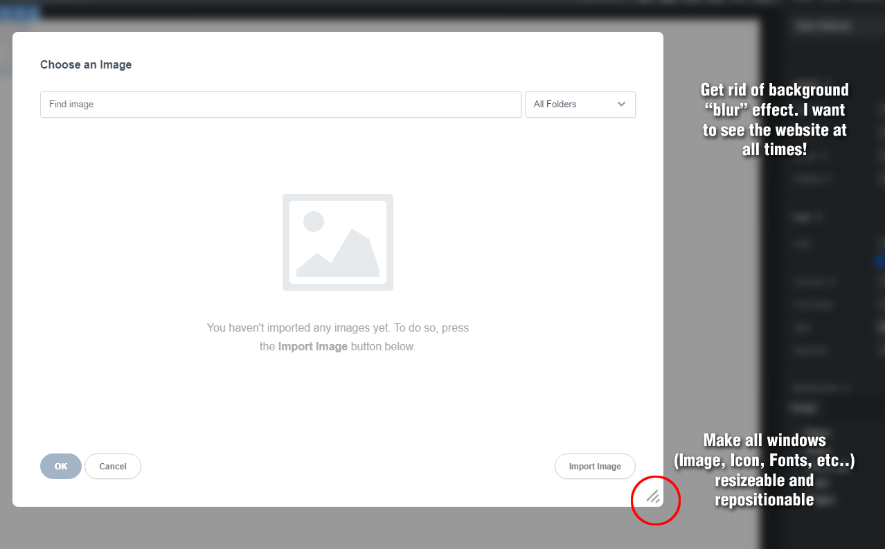
I’d like to suggest that all windows that “pop up” (Images, Icons, Fonts, etc…) behave like the color picker palette. They should be repositionable, preferably resizeable, and the they should not blur the background behind them. The blur effect may be cool looking, but it really serves no practical purpose, and frankly I want to be able to see my website at ALL TIMES for design purposes.
It would also nice if the Font chooser allowed one to type in custom text. “The Quick Brown Fox…” just doesn’t cut it when you’re trying to visualize things like all caps headlines, or punctuation, etc…
Thank you for the suggestion! We will look if it would be possible to have the dialogs movable/resizable. If others would like to see this feature we would love to hear their feedback.
As for the Font chooser, this is already supported, you can click and edit the preview text.
I like the idea of resizable and movable for Modals. That’s one of the things I found frustrating the first time I tried doing that, as it’s not always intuitive how to get those things changed in the code.
@martin
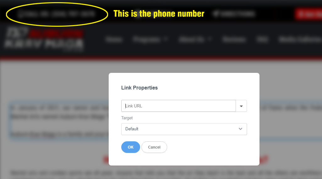
Here’s a perfect example of why the blur effect drives me crazy. I just highlighted some text in a paragraph that I want to turn into tel: link.
The phone number happens to be in the header of the website (circled in yellow in the image below). It’s a new client, so I haven’t memorized their phone number. If I could see the number, I could easily type it into the Link Properties box, but since I can’t see it, and haven’t memorized it, I must remember to first highlight it and copy it before I click the link button so I can then paste it into the Link URL field.
Giving this topic a bump. Wondering if the devs have given any more thought to resizable and repositionable dialogue boxes, as well as eliminating the “blur” effect (or just changing it to a dark overlay)
I completely agree with your sentiment regarding the blur effect. While it may have been introduced with good intentions, simplifying it to a subtle darkening effect could indeed be a more user-friendly and aesthetically pleasing choice.
I agree that we should make the Link Properties dialog floating, like we do for Character Input. This will solve the issue with using page text in the link. We can also think of ways to make some dialogs resizeable so that more content can fit on a big screen.
I am not convinced about the suggestions of making the Image and Icon dialogs floating though. A few problems I can think of:
Dialogs can’t float outside the confines of the Bootstrap Studio window.
The images/icons won’t change until the confirmation button (OK/Select) is pressed.
Only one modal can be open at a time.
A floating dialog means that the page underneath it can be changed, different elements can be selected etc. If you have the image dialog open, what ought to happen if you select another image. Should the dialog disappear or start affecting the new image instead?
These are solvable of course, but will take a lot of work and I am not convinced this is what we should be spending our time on.
Making them floating but still being a modal might be the simplest solution. I mean it is ok to block what is underneath but being able to move them around can still be very handy so that we can take a look at what is normally covered by the panel when it opens. (Provided the blur effect is gone for good, of course.)