I’m trying to convert a ‘standard’ css/html design to Bootstrap 5. I’m having a hard time wrapping my head around the grid system equivalencies. Is there some documentation that sets out what ‘standard’ css is equivalent to what Bootstrap css?
For example, is “grid” the equivalent of “container”? I’d like to see a grid system represented by style sheets for standard css along with the Bootstrap equivalent.
I don’t use Grid myself, but I would think that if you load up a template in BSS and load up your site that’s using Grid in another editor and compare the CSS you would be able to see what the differences are that way. Check what the .grid class contains and what the col-md-12 contains and go from there?
Bootstrap is built in a 12 column system. It’s pretty simple to use so I would think you should be able to find your comparisons by doing that. If I’m mistaken though let us lnow, as I said I don’t use Grid so …
Thanks. That would be a good idea if the design I wanted to convert was already in both styles. But I am trying to create the Bootstrap style from a css design and watching in the Firefox console how mine compares with the original. Having been doing that and being only partially successful, I still have the question: what are the equivalencies between grids and containers.
The aim is is not to simply have them look alike (easy) but behave exactly alike in response to screen changes (not simply based on resemblance).
Bootstrap’s grid is based on CSS flexbox. CSS Grid is sort of the “next iteration” of CSS responsive design. I’m not sure if there are direct corollaries in Bootstrap to everything that is available in CSS Grid. CSS grid can do things that flexbox cannot. I would recommend becoming familiar with how Bootstrap uses flexbox first, and that might help you in the task of trying to convert from one grid system to another.
Thanks for that second article @printninja. It might help clarify things for me. The Mozilla developer info is fairly straightforward but not seeing it side by side with the Bootstrap take on implementing similar layout is challenging for my brain.
FWIW, as I understand it, both CSS Grid and CSS flexbox can be used together in Bootstrap. But I can sympathize with your difficulty. The older I get, the more challenging it is for my brain to keep up with every new development in the website industry. It took me a good year just to get a solid handle on building websites via fixed position design vs responsive design.
Very valuable article @printninja. I now understand my dilemma. I might need to ‘escape’ the Bootstrap flow to integrate design elements from the other systems at play.
I’ve been hamming around with Web design for a while and I’ve seen old methods criticized, dumped and revived with newer technology that does better what was being attempted in the old days. WYSIWYG was the scourge, we were not to use such methods–until acceptable WYSIWIG was reinvented. Grids (flexible tables?) do more efficiently what tables were not supposed to do.
In my print career I watched as page layout applications moved to efficient blocks from clumsy columns as QuarkEXress supplanted PageMaker. Now there’s a big blow-up as blocks have taken root online and WordPress is fully embracing block layout to the chagrin of some users who are biased to content over design.
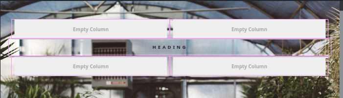
These images show snips from the design I’m copying and what I’ve been doing with BS Studio.
Though given it was discussed in 2017, again in 2019, along with CSS Grid since gaining wide browser support, it would be nice if these below comments would come to fruition.
I also come from a printing/graphic design background, going all the way back to Pagemaker (on the PC though, because I never saw the point in spending 2 times more for a Mac when the software was basically the same.) I never really cared for Quark. I forced myself to learn it it because it was ubiquitous in pre-press for decades. Unlike most people in typesetting, I always found Pagemaker more intuitive. Most of my contemporaries thought I was crazy sticking with Adobe, but I had a gut feeling that they were going to eventually win the DTP war because of PDF. Adobe had a huge advantage in owning the PDF format, and they took full advantage of it while Quark was still fumbling around with exporting fonts and linked images. As I understand it, Quark screwed up badly in the 2000’s with some bad releases, and basically lost it’s position as king of the DTP programs to InDesign.
PDF definitely had it’s problems in the early days, but I could see the writing was on the wall. Quark simply didn’t move fast enough to embrace PDF. I remember around the time that InDesign CS3 came out, they announced they were switching from teaching Quark to teaching InDesign in the big design colleges like Rochester University and F.I.T. That’s when I knew Quark’s days were numbered. By the time InDesign CS 5 rolled out, Quark was pretty much history. I vaguely remember Quark staging a bit of a comeback in the mid 20-teens, but I think by that point I guess it was too little, too late. I actually haven’t used either program in years (now that 90% of my work is web design,) but I don’t think Quark has much of a market share these days.
I guess it’s a matter of how many people really need the advanced capabilities of CSS Grid. For me, I’ve always found flexbox sufficient to do whatever I’ve needed to do, but my websites tend to be pretty straightforward. Nothing especially fancy. I think the learning curve with CSS Grid is quite a bit steeper than CSS Flexbox, which may account for why many casual developers have shied away from it. I’m sure if Bootstrap itself replaces Flexbox with Grid, then we’ll see a more widespread adoption.
Unless I’m mistaken, Webflow uses CSS Grid. I also know Pinegrow has a full set of CSS Grid visual tools, but I barely use Pinegrow anymore. The PG developers (and many users) got very focused on the Wordpress capabilities of the program, which kind of turned me off from using PG. I don’t care for Wordpress at all.
Thanks for your responses @bss_user, they have been very helpful alongside the link from @printninja. Now that I’ve read all all this, it seems there’s a need for better organized information on Bootstrap. While a lot of information exists not much of it is procedural.
A similar background with the use of PageMaker and Quark. I started with Aldus, always on PC. Then one of the print shops I used to output negatives sort of bullied me into using Quark because they were using it and many of their jobs were in Quark. A staffer actually gave me a copy of Quark. I didn’t like the blocks at first but then PM also followed suit. Because Quark also gave the chance to customize graphics without going to an editor, I lapsed into it using clipping paths etc.
Most print stuff that I happen to do today don’t need much layout skills as they’re mainly books, so setting up styles on a word processor and converting to PDF is good enough. And these days that I only use Linux mean doing the best with what I have.
I’m bumping this up because I’ve been learning CSS Grid via some lessons in Mimo (have to learn things in specific order to gain access to the next area and CSS Grid is part of the Web Development setup).
I’m personally finding this a whole lot easier than Flex by far. Almost as simplistic as setting tables which I have good knowledge of and CSS Grid is actually very similar.
So I’d like to bump this in answer to Martin a few months back on if interest is there enough. Count me in. I’d prefer to be able to use both of them at the same time (maybe flipping between tabs?) rather than having to make a choice and stick solely with it if at all possible.
@jo-r Have you managed to get this working in BSS? I was just looking at the Bootstrap 5 Docs and it says:
CSS Grid is opt-in. Disable the default grid system by setting $enable-grid-classes: false and enable the CSS Grid by setting $enable-cssgrid: true. Then, recompile your Sass.
I was just wondered if you had managed to get it working, would be interesting to try out
I haven’t messed with it yet, have been learning the grid via Mimo app. According to the app we shouldn’t need to go through all that, and the 2 systems should work together by using the correct display settings and such. In examples they were using display: grid; for the main setup and then using display: flex; within grid items for positioning contents of an item. Not sure why we’d need to go through all that setup you said. I’m thinking this might already be set up in BSS since Martin said BSS was Grid ready, just manually, no drag and drop stuff for it at this time.

